-
This forum has been archived. New threads and replies may not be made. All add-ons/resources that are active should be migrated to the Resource Manager. See this thread for more information.
You are using an out of date browser. It may not display this or other websites correctly.
You should upgrade or use an alternative browser.
You should upgrade or use an alternative browser.
Can someone help make this image into a background for member card?
- Thread starter ArnyVee
- Start date


The problem with stock of a retro tv is the aspect ratio ...old tv's were 4:3 or 4 inches for every 3and most new ones are 16:9 or 16 inches for every 9 which is a drastically different ratio. That being said the current state of the css controlling the display of the membercard data has the information in a rather 16:9-ish method if you will. There-for to use a classic set would require a distortion to the image to fit the information laid over it in such a way that any viewer would see it and it would look wrong ( this is my speculation ) as in the old tv's were almost squares and the new ones are rectangles and for most people who have had both in their lifetime it won't look like something that exists(unless someone corrects me and says they have a wide-screen aspect monitor that had a cathode tubeI have a PSD of a Retro TV if you like. It might look better than a plasma!
") )
)styles\default\xenforo\overlay\member-card.pngNow, just have to find where to replace the default image to test things out
Remember to rename the image to the member-card.png as Brogan had mentioned.styles\default\xenforo\overlay\member-card.png
Also...
If you want to be able to swap them back and forth as your testing...
rename the original: member-card.ORIG.png
so that when you upload you don't overwrite it this way if they don't tickle your fancy you can simple delete the current one and rename the .ORIG.png image back to its original name.
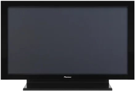
I didn't like the shine on the sides so made some quick amendments. The tv is larger than the member-card so I kept to the original size as it just looked squashed and odd looking being re-sized. Anyway, the screenshot (below) and the changes I made are also below that I did in the member_card.css. If you prefer this variation let me know and I'll post the transparent png (i cropped the edges).
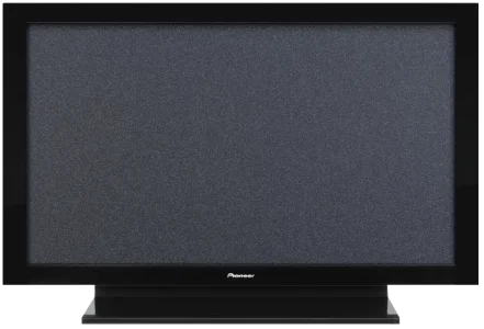
Edit: Posted the transparent TV image.

member_card.css changes (replace the code if you haven't made any existing changes to the template) if you have you can view what has changed in my template.
Edit: Posted the transparent TV image.
member_card.css changes (replace the code if you haven't made any existing changes to the template) if you have you can view what has changed in my template.
Code:
/** member card **/

.xenOverlay.memberCard
{
	background: transparent url(@imagePath/xenforo/overlay/member-card.png);
	color: white;
	width: 700px;
	height: 477px;
}

	.xenOverlay.memberCard .avatarCropper
	{
		position: absolute;
		top: 60px;
		left: 60px;
		border: 0;
		padding: 0;
		background-color: black;
	}

	.xenOverlay.memberCard .userInfo
	{
		position: absolute;
		top: 60px;
		right: 80px;
		font-size: 11px;
		width: 330px;
	}

		.xenOverlay.memberCard .userInfo h3
		{
			color: #aba;
			font-size: 18px;
		}

			.xenOverlay.memberCard .userInfo h3 a
			{
				color: #aba;
			}

		.xenOverlay.memberCard .userInfo .userTitleBlurb
		{
			margin: 5px 0;
		}

			.xenOverlay.memberCard .userInfo h4
			{
				color: #9a9;
				font-size: 10pt;
			}

			.xenOverlay.memberCard .userInfo .userBlurb
			{
				font-size: 11px;
			}

		.xenOverlay.memberCard .userInfo .status
		{
			font: italic 10px georgia;
			margin: 5px 0;
			overflow: auto;
			max-height: 44px;
		}

			.xenOverlay.memberCard .userInfo .status a
			{
				color: white;
			}

		.xenOverlay.memberCard .userInfo .userStats
		{
			width: 100%;
		}

		.xenOverlay.memberCard .userInfo .userStats th
		{
			color: @mutedTextColor;
			vertical-align: top;
		}

		.xenOverlay.memberCard .userInfo .userStats td
		{
			vertical-align: top;
			text-align: right;
			padding: 0 10px;
		}

		.xenOverlay.memberCard .userInfo .userStats td:last-child
		{
			padding-right: 0;
		}

	.xenOverlay.memberCard .userLinks
	{
		margin: 5px 0;
		border-bottom: 1px solid #565;
		padding: 2px 0;
	}

		.xenOverlay.memberCard .userLinks a
		{
			margin-right: 10px;
			color: #9a9;
			font-weight: bold;
		}

	.xenOverlay.memberCard .lastActivity
	{
		/*font-size: 10px;*/
		border-top: 1px solid #565;
		margin-top: 5px;
		padding-top: 5px;
	}

	body .xenOverlay.memberCard a.close
	{
		top: 5px;
		right: 9px;
	}
Attachments
How about putting some sort of image in the background as if the TV is on?
Obviously it would need to be muted to avoid overpowering the content but you could have a whole set of them and rotate them throughout the year/tv season.
The transparent png is there so if anyone wants to apply imagery by all means. I did a quicky with some background static.

Attachments
on off switch was what I was talking about with the css edits...Good Call ShelleyYou could actually design a on/off switch for the close.png if you wanted to keep some consistency with the television screen though bare in mind that the close.png is used in other areas and may appear odd looking.
This keeps getting better! Thanks Shelley
What were you referring to as the 'on/off' switch? Do you mean in place of the actual "x close" button?
Since there is some extra space towards the bottom of the TV screen, any ideas on what I can add there? Maybe some links or images for 'upgrading your account' or something else?
What were you referring to as the 'on/off' switch? Do you mean in place of the actual "x close" button?
Since there is some extra space towards the bottom of the TV screen, any ideas on what I can add there? Maybe some links or images for 'upgrading your account' or something else?
I didn't like the shine on the sides so made some quick amendments.
Shelly, you really do nice work.
