• This forum has been archived. New threads and replies may not be made. All add-ons/resources that are active should be migrated to the Resource Manager. See this thread for more information.

Camo - xF

Status
Not open for further replies.

Steve F

Well-known member
Here is a perfect style for those gaming and clan sites Powered by XenForo.

Installation: Read the README.txt in the download.

Usage: You are permitted to use this style free of charge on any number of your forums so long as you do not redistribute the package in any way shape of form!

Thanks & Enjoy

DEMO

Supported Version: XF 1.1.1

Updated to: XF 1.1.1 (12-27-2011)
  • Complete rebuild for XF 1.1.1 (To much to list)
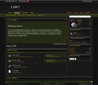
Index.webp


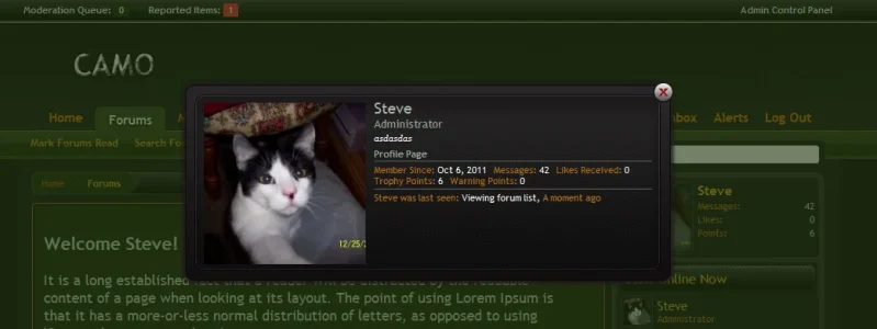
MemberCard.webp
 

Attachments

thanks good job
wink.png
 
The only real complaint that I have about this skin, is the orange text - a bit too dark to read well.
But I still like the skin. :)
 
Thanks for the feedback Peggy. Is there a certain area that doesn't show well? Maybe the navtabs are dulling it down to much.
 
It's the headings - Members Online/Forum Statistics/The Paranormal/The Mysterious, etc. The orange is just a bit too ummmm... pale?
My sight is not great on dark skins anyway, and that orange is a bit hard to read, even in the large font. If you made it close to the same color as the board title (Spooky Minds Community), that might help relieve the eye strain.
 
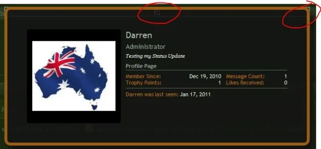
This is nice. I don't do dark styles myself but some of my members have been asking for one. Any reason that the Member Card doesn't have an X in the corner to close it?

I also see a little broken image in the Member Card top Center.

camo.webp
 
My original thought on the member-card for this style was that, you can close the member-card by clicking anywhere on the screen except for the card itself.

The broken image I have no idea as I cannot reproduce it. What browser are you using?

Thanks
 
Chrome on the Demo Site.

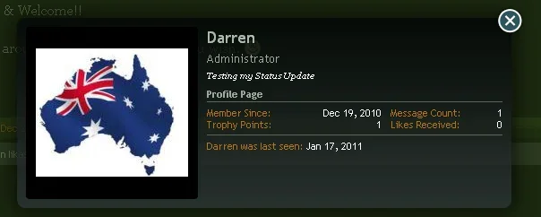
Both items are now fixed on the Demo site. Chrome and IE8

Thanks

card.webp
 
the welcome box doesnt look right... its too camouflage if you get me needs to stand out abit more! lol
 
Okay, I missed the .importantMessage class. Add this to the top of the EXTRA.css template to fix the text problem.

Code:
.importantMessage
{
      background-color: rgba(142, 196, 0, .1) !important;
      color: @primaryMedium !important;
}

.xenfans_welcome {
      background: url('styles/skinden/camo/xenforo/gradients/node-bg.png') repeat-x center !important;
      text-shadow: none !important;
}
 
Qwk86gn, have you thought about making a light style of this?

Same exact colors/texture on the navbar, category strips, postbit, etc, but background, content background, etc light - like a cream, ivory, or off-white.
 
I can try and mess around with it, not sure if it would be easier just starting fresh and doing something similar.
 
Status
Not open for further replies.
Top Bottom