Between Gaming Community

Cal

Well-known member
bglogo_smallcube.jpg

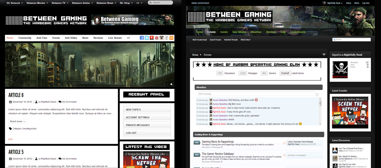
I finally got the time to put up a new project on xenforo. The political community ended up going back to vbulletin because the old folks couldn't figure out xen and then would get all *****y about it. So here is what I've got.

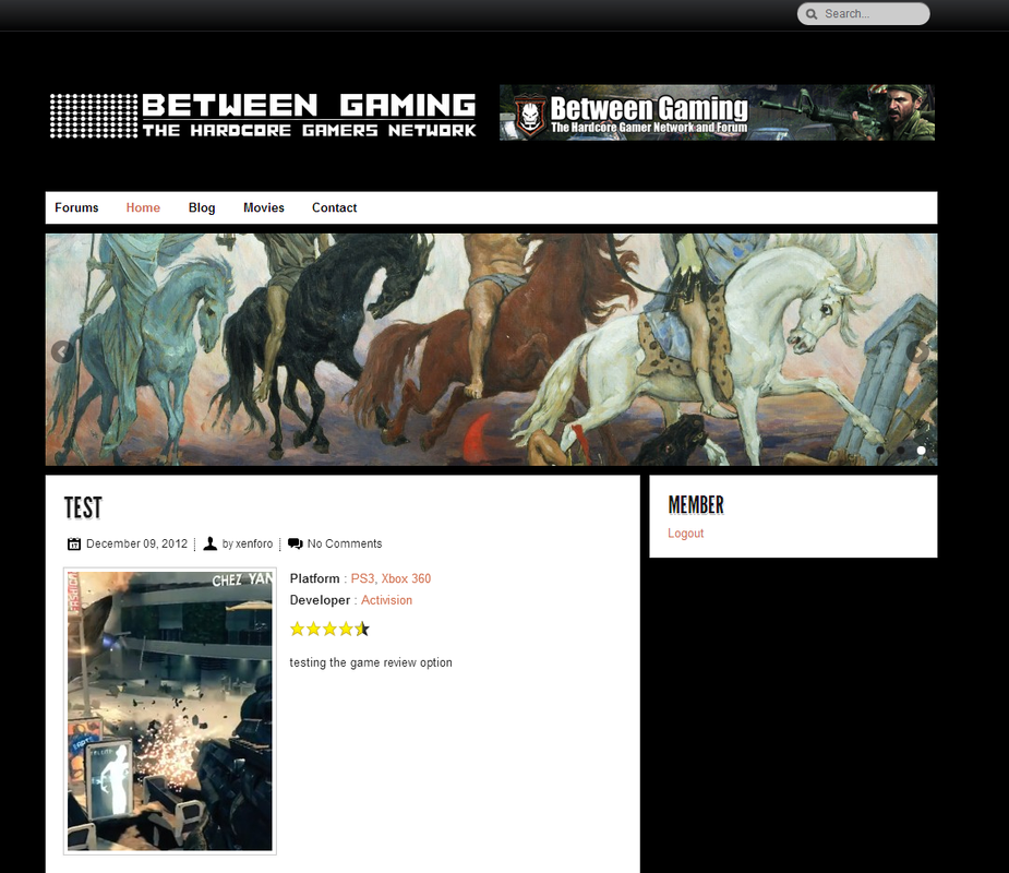
Between Gaming is a community dedicated to games. There will be a cheats database, game news, game reviews, clan hosting (if anyone is interested), and a lot of other ideas. Basically all I've done so far is the theme and restructure the forum.

Activity wise it's mostly inactive. This is a gaming community that was popular and was being sold on Digitalpoint. We bought it up, kinda let it sit for awhile (it was about the same status then too). Converted it to xenforo and here we are.

So I guess we're basically starting from scratch. I have xenporta up but it's not going to meet my needs. I may try to integrate wordpress to it, I did see a bridge on the forum.

So if any of you would be kind enough to give me the complete honest and brutal review I would be happy. Design, features, suggestions, revisions, the whole 9 yards - you guys know what I mean.

http://betweengaming.com/index.php?forum/

Also I'm probably going to hire a small staff, maybe a co-admin to help me. Anyone interested?
 
Are you satisfied with the fonts you are using on your forum? :) Maybe you can use a more unique font.

--

Is there something white in colour blocking the counters (Members, Lastest Members, Discussion etc) ?
 
Are you satisfied with the fonts you are using on your forum? :) Maybe you can use a more unique font.

--

Is there something white in colour blocking the counters (Members, Lastest Members, Discussion etc) ?

I'm actually fairly happy with the font. I know it's basic but I went through a lot of fonts just to get to it. I have several hundred fonts on my computer. I chose impact mostly because I don't want this to be another fan-boy forum. There's a ton of those already. I have some bigger plans I'm working on putting into play actually. Hoping to make a little more of this than just a forum community.

I don't think any color is blocking the counters. I can try to set it to a different color though.
 
Liking the style Cal, here's my suggestions/feedback:

  • Hhating the forum node icons if I'm honest
  • Banner looks fantastic
  • I'd ditch the minecraft background on the content but keep the same colors.
  • darken the opacity in the navigation bar a bit
  • fix the default blue on the forum page, title links and last post box
But coming nice :)


Hey Russ. Thanks for the feedback man.

I'll probably change the forum node icons. I did them at 3AM last night so I was kinda un-motivated at the time. Those green blocks are just filler for now. I do need to figure out what I am going to replace there. Maybe the shields like I used in my logo. We'll have to see what I come up with. I'll have to do it tomorrow when I'm off work.

Appreciated. on the banner. Took awhile to get my preferences down right and put it all together like that lol.

I'll do that a little later tomorrow. I'm not terribly sure what you are looking at but I'll figure it out. I remember seeing a blocky kind of dark grey background on content but I don't see it now. Maybe I edited last night? If so I don't remember. My laptop shows a solid charcoal grey right now.

I'll do that tomorrow. If you can't tell I'm at work on my laptop and all my PSD's are at home on the PC. So everything is done tomorrow lol.

Yeah I'm actually going to get rid of the blue completely. I'm going to favor black text. The last post box I'm thinking some sort of dark green. We'll have to see. I can do that tonight since it's just in the color palette.
 
I made all of those changes. It looks way better in my opinion! :cool:

Any gamer forums on here have any ideas on attracting people???
 
What I like:

  • FWX8e.png
  • CzEpE.png
  • NRW9w.png
  • njt7R.png
What I don't like:

  • 5xwvq.png
    (I think the who's online box should be moved to the sidebar, just doesn't feel right there.)
All round, awesome looking site, and it has a lot of great features.
 
You have some issues with the footer (it has a huge empty vertical space). Otherwise .. I really love it. You are using a dark gaming background, but the main content has a white background, it's easy to read. You also have a layout that doesn't stretch like crazy. Really cool job ;)
 
Thanks. I'm actually going to get rid of a lot of the green I think. I do need to figure out that footer, not sure what's causing it honestly. I'm integrating the site with wordpress because I want it to be a lot more than a forum. I've gotten the integration nearly all squared away. I'm trying to get design right now. When you'll see it you'll understand the need to lose the green, everything is going black out or some variation. I need some sleep but hopefull I'll get everything done by mid week and I can redo it all again for real (all of this is on a sandbox server right now).

I did change the logo image. Mostly because that shield/skull is from Call of Duty. I wanted to be more original and have my own branding.

Noname.png


image.png
 
Back
Top Bottom