You are using an out of date browser. It may not display this or other websites correctly.
You should upgrade or use an alternative browser.
You should upgrade or use an alternative browser.
Resource icon
Avatars - Big & Tall
- Thread starter Jake Bunce
- Start date
To get this working in responsive design by Arty in XF 1.2 all you need to do is make two changes.
Add everything in Jakes CSS to your extra.css EXCEPT FOR
Rich (BB code):.messageUserInfo { width: 170px !important; } .message .messageInfo, #QuickReply { margin-left: 186px !important; }
^^^APPLY the .messageUserInfo css in your Style Properties/Message Layout/User Info Container/Miscellaneous width.
Apply the messageInfo css to Style Properties/Message Layout/Content Container/Background/Left/Margin
After you do that, add this part to responsive_extra.css
Change the number 142 to 48
Rich (BB code):.thread_view .messageList .messageUserInfo a.avatar img, .thread_view .quickReply .messageUserInfo a.avatar img, .conversation_view .messageList .messageUserInfo a.avatar img, .conversation_view .quickReply .messageUserInfo a.avatar img { width: 48px; height: auto; }
This is my new 1.2 edit
Code:<xen:if is="@enableResponsive"> @media (max-width:@maxResponsiveNarrowWidth) { .thread_view .messageList .messageUserInfo a.avatar img, .thread_view .quickReply .messageUserInfo a.avatar img, .conversation_view .messageList .messageUserInfo a.avatar img, .conversation_view .quickReply .messageUserInfo a.avatar img { width: 48px; height: auto; } .avatarHolder .userMood img { display: none; } } </xen:if>
Is this still working with 1.2.1?
I can't get it to work.
yeah, i haven't been able to get it to work either 
Change the "m" to an "l" in message_user_info just as Jake Bunce describes it.
ADD in EXTRA.css
CREATE responsive_extra.css
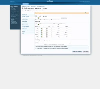
In Style properties adjust size changes like this:

Best regards.
ADD in EXTRA.css
Code:
/* == AVATAR ADJUSTMENTS == */
.thread_view .messageList .messageUserInfo a.avatar img,
.thread_view .quickReply .messageUserInfo a.avatar img,
.conversation_view .messageList .messageUserInfo a.avatar img,
.conversation_view .quickReply .messageUserInfo a.avatar img,
.avatar img, .avatar .img, .avatarCropper
{
max-width: 142px;
height: auto;
}
/* == AVATAR ADJUSTMENTS == */CREATE responsive_extra.css
Code:
<xen:if is="@enableResponsive">
@media (max-width:@maxResponsiveNarrowWidth)
{
.thread_view .messageList .messageUserInfo a.avatar img,
.thread_view .quickReply .messageUserInfo a.avatar img,
.conversation_view .messageList .messageUserInfo a.avatar img,
.conversation_view .quickReply .messageUserInfo a.avatar img
{
width: 48px;
height: auto;
}
.avatarHolder .userMood img {
display: none;
}
}
</xen:if>In Style properties adjust size changes like this:


Best regards.
Last edited:
@electrogypsy
I happened to get it working. So I edited my above post for detailed instructions. I hope this will help you.
Best regards.
I happened to get it working. So I edited my above post for detailed instructions. I hope this will help you.
Best regards.
Change the "m" to an "l" in message_user_info just as Jake Bunce describes it.
ADD in EXTRA.css
Code:/* == AVATAR ADJUSTMENTS == */ .thread_view .messageList .messageUserInfo a.avatar img, .thread_view .quickReply .messageUserInfo a.avatar img, .conversation_view .messageList .messageUserInfo a.avatar img, .conversation_view .quickReply .messageUserInfo a.avatar img, .avatar img, .avatar .img, .avatarCropper { max-width: 142px; height: auto; } /* == AVATAR ADJUSTMENTS == */
CREATE responsive_extra.css
Code:<xen:if is="@enableResponsive"> @media (max-width:@maxResponsiveNarrowWidth) { .thread_view .messageList .messageUserInfo a.avatar img, .thread_view .quickReply .messageUserInfo a.avatar img, .conversation_view .messageList .messageUserInfo a.avatar img, .conversation_view .quickReply .messageUserInfo a.avatar img { width: 48px; height: auto; } .avatarHolder .userMood img { display: none; } } </xen:if>
In Style properties adjust size changes like this:
View attachment 55956 View attachment 55957
Best regards.
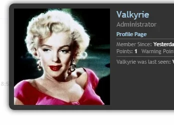
@it_ @Jake Bunce OK...did this and it worked except for one thing...the overlay...
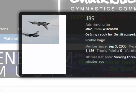
Any idea how to fix this?
Mike Edge
Well-known member
Trying this but all avatars and left side are same size.. I want 1st post to be 'l' and others 'm'
Code:
 <xen:if is="{$post.position} == 0">
.thread_view .messageList .messageUserInfo a.avatar img,
.thread_view .quickReply .messageUserInfo a.avatar img,
.conversation_view .messageList .messageUserInfo a.avatar img,
.conversation_view .quickReply .messageUserInfo a.avatar img
{
    width: auto;
    max-width: 142px;
    height: auto;
}

.messageUserInfo
{
    width: 220px !important;
}

.message .messageInfo,
#QuickReply
{
    margin-left: 235px !important;
}

<xen:else />

.thread_view .messageList .messageUserInfo a.avatar img,
.thread_view .quickReply .messageUserInfo a.avatar img,
.conversation_view .messageList .messageUserInfo a.avatar img,
.conversation_view .quickReply .messageUserInfo a.avatar img
{
    width: auto;
    max-width: 142px;
    height: auto;
}

.messageUserInfo
{
    width: 150px !important;
}

.message .messageInfo,
#QuickReply
{
    margin-left: 180px !important;
}

</xen:if>@it_ @Jake Bunce OK...did this and it worked except for one thing...the overlay...
View attachment 56318
Any idea how to fix this?
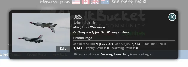
Not really sure what I am doing with CSS...but I added the following to post #45 and it seems to work...
Code:
.xenOverlay.memberCard .avatarCropper img, .xenOverlay.memberCard .avatarCropper a, .xenOverlay.memberCard .avatarCropper
{
    max-width: 192px !important;
    width: auto;
    height: auto;
    left: 0px !important;
    top: 0px !important;
}
I believe this changed in 1.2. I haven't revisited it yet.
I believe this changed in 1.2. I haven't revisited it yet.
Jake, could you update thi for XF 1.2 please?
Thank you.
I believe this changed in 1.2. I haven't revisited it yet.
I asked this a while ago, would you be so kind to update it to 1.2 + @Jake Bunce ? Thank you for this resource.
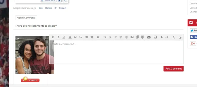
I second thisWhat would I add to the CSS to fix this in the media gallery?
View attachment 98159
I fixed this in the end. Add:I second this
.mediaComments .messageUserInfo a.avatar img
so you get:
.thread_view .messageList .messageUserInfo a.avatar img,
.thread_view .quickReply .messageUserInfo a.avatar img,
.conversation_view .messageList .messageUserInfo a.avatar img,
.conversation_view .quickReply .messageUserInfo a.avatar img,
.mediaComments .messageUserInfo a.avatar img
Remember to add the comma on the previous line.
I have followed the instructions.
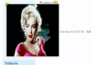
While it is now 200x200. I noticed that when I post a message on the forum, the image is squished (uploaded an example titled "wrongsize" - excuse the mess in the background, i'm still working on reskinning). On my member card, the image is not squished and it looks like how it should (uploaded the example as "rightsize").
So I am wondering if I missed a step or if there's another way to resize my avatars to 200x200 without compromising the quality of a photo when posting a message. I'm not sure if this is a resizing or cropping issure but some help would be nice!
I understand that auto height allows the image not to stretch. Is there any way to set it so that it could crop the image instead?
Attachments
Last edited:
@Jake Bunce Got this working great full-size on 1.4 but responsive is still ugly despite creating the reponsive_extra.css

Change the "m" to an "l" in message_user_info just as Jake Bunce describes it.
ADD in EXTRA.css
Code:/* == AVATAR ADJUSTMENTS == */ .thread_view .messageList .messageUserInfo a.avatar img, .thread_view .quickReply .messageUserInfo a.avatar img, .conversation_view .messageList .messageUserInfo a.avatar img, .conversation_view .quickReply .messageUserInfo a.avatar img, .avatar img, .avatar .img, .avatarCropper { max-width: 142px; height: auto; } /* == AVATAR ADJUSTMENTS == */
CREATE responsive_extra.css
Code:<xen:if is="@enableResponsive"> @media (max-width:@maxResponsiveNarrowWidth) { .thread_view .messageList .messageUserInfo a.avatar img, .thread_view .quickReply .messageUserInfo a.avatar img, .conversation_view .messageList .messageUserInfo a.avatar img, .conversation_view .quickReply .messageUserInfo a.avatar img { width: 48px; height: auto; } .avatarHolder .userMood img { display: none; } } </xen:if>
In Style properties adjust size changes like this:
View attachment 55956 View attachment 55957
Best regards.
Admin CP -> Appearance -> Templates -> message_user_info
If you do this and replace
Code:
<xen:avatar user="$user" size="m" />
Code:
<xen:avatar user="$user" size="l" img="true" />and then style properties > Message Layout > user info container width: 170
style properties > Message Layout > content container left 185 (this may not need to be editted depends on your theme)
the responsive version will have the avatar adjusted to your specifications.
That being said I am trying to figure out how to stop the avatar from being resized to fit a specific height/width when it is TOO SMALL. I understand resizing the image when its too large to make it fit but if I make myself a nice avatar thats lets say 100px by 100px under the current settings if I upload it when I post it will resize the avatar and make it look all blown up and stupid but from my profile page it will show the avatar its actual size. So how can I go about modifying this code to prevent the avatars been blown up and show them their true size?
