- Affected version
- 2.2.7 PL 1

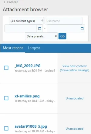
- Filter controls are crammed together without vertical spacing and don't look like they have any alignment
- Thumbnails are not being shown at all if there are only image attachments on the page (they are being shown if there are non-image attachments)
- Using the delete icon does require horizontal scrolling