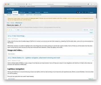
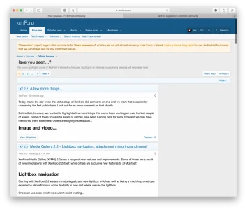
I realize that this can be changed in individual themes... but defaults do matter.
The excerpt format for article excerpts should be improved. A sidebar or some other limitations would help legibility significantly on desktop views. It looks ok on Mobile due to the limited width of the page.
See:

 baymard.com


The excerpt format for article excerpts should be improved. A sidebar or some other limitations would help legibility significantly on desktop views. It looks ok on Mobile due to the limited width of the page.
See:
Readability: The Optimal Line Length – Baymard
The length of text lines substantially impacts their readability — yet this is often overlooked in e-commerce. See our latest test findings on line length readability.
The optimal line length for your body text is considered to be 50-60 characters per line, including spaces (“Typographie”, E. Ruder). Other sources suggest that up to 75 characters is acceptable. So what’s the downsides of violating this range?
- Too wide – if a line of text is too long the reader’s eyes will have a hard time focusing on the text. This is because the line length makes it difficult to gauge where the line starts and ends. Furthermore it can be difficult to continue onto the correct line in large blocks of text.


Upvote
25

