[Andrew] Bookmark Users

[Andrew] Bookmark Users 1.0.2

No permission to download

AndrewSimm

Well-known member
AndrewSimm submitted a new resource:

[Andrew] Bookmark Users - Bookmark users using the built in Xenforo bookmarking system.

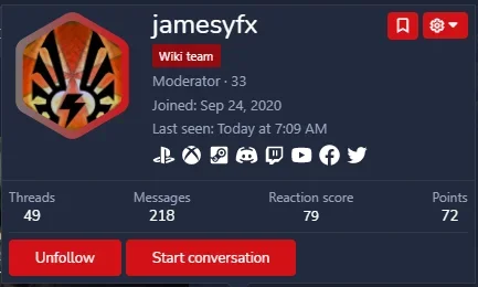
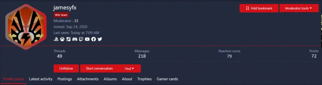
[Andrew] Bookmark Users allows users to use the Xenforo bookmarking system to bookmark users. All features, such as messages and labels are available when bookmarking users.

Why would I want to bookmark users as opposed to just following them?
Bookmarks are different from follows in that with bookmarks users can save a note (message) about a user and apply labels to the user.

Features
  • Bookmark users
Permissions
  • Can bookmark users

Read more about this resource...
 
Thanks for this, very useful!

I made a few changes to the template modification that you might want to add in the next version.

1) Included a check to see if the user is viewing their own profile / tooltip. Maybe there's a reason for members to be able to bookmark themselves, we don't want it though.
2) Added the bookmark classes to enable highlighting (indicating a member has been bookmarked).
3) Removed the phrase, leaving just the icon.

Code:
<xf:if is="$xf.visitor.user_id !== $user.user_id AND $xf.visitor.canBookmarkUsers()">
    <xf:button class="button--link">
    <xf:macro template="bookmark_macros" name="link"
              arg-content="{$user}"
              arg-class="bookmarkLink bookmarkLink--highlightable"
              arg-confirmUrl="{{ link('members/bookmark', $user) }}"
              arg-showText="{{ false }}"/>
    </xf:button>
</xf:if>

My coding is amateur at best so I'm not sure if this is the right way to do it, but it seems to work :)

I agree with your first point and have added the update to the addon. For site owners that wish to continue to allow this, they will just need to remove the updated parameter. I did not block it in the PHP code. I decided against the other two suggestions. The highlight class doesn't match with the follow/unfollow text color. I also left the wording because all of the other buttons in that area have text as well. Thank you for your suggestions.
 
I hope you will also adjust this to 2.2 and higher if necessary, thanks for this useful addon and for publishing it for free. :D
 
Things i have seen today:
  • When i show the bookmark icon, the button is one or two pixel higher than the rest. (QHD 125% Win10)
  • The button is grouped with follow and ignore, i dont see a reason why it fit to the other two.
  • when i goup more than two buttons it looks not nice on smaller dvices.

So i will try to put the button outside of the group; you and/or other may like this idea also.
I am curious to what you come up with. if you don't mind, please share some screenshots when you are done.
 
pixel2.png

Follow and Ignore are a group for me. They fit.
Bookmark fits to nothing.
Pokes also.
For Conversations i have two buttons, they fit as a group.


Here i have resized the screen. As you can see the groups stay together.


pixel3.png

I still dont like, so i will shorten "Add Bookmark"pixel4.png
Less screen means that the group is divided. One button with border, one without. To solve this we can remove all groups.

Anyway. The only thing you could do is to reduce the Icon-size to one pixel less. Maybe this helps on my Windows-Screen with 125%. Probably 1 of thousand users will see this. :)
 
I wish i could bookmark you because this is a cool idea.

Bookmarks are useful but it's easy to forget to use it.

Maybe users could be reminded of the bookmarking feature after 20 posts and if they don't have a bookmark. The social media generation needs to be educated about non-social media features 👍
 
Yes, no, maybe.

Bookmarks = to follow, but with a comment and without to be disturbed by news from the followed one.
On the other site, bookmarks for users are in one place with cats, forums, resources, threads. So i have "all my things in one place" and need no more new links in a navi.
From another view all these funny functions are just too much, because it is hard enough to use a website instead an app. (Install, tell my name and age, swipe, swipe, wait, wait, send a smilie. Goto 10!)

Because some people will like the idea to make notices and because the rest will not know that bookmarks are existing, i use them.

Depending on the forums content, i like also the idea to share the bookmarks like Mr. Wong in 2000x?
For this there is an addon from XON, i guess. If i would have a forum with recipes for example than i would love the sharing of bookmarks, because people with same taste share their links.
 
View attachment 248984

Follow and Ignore are a group for me. They fit.
Bookmark fits to nothing.
Pokes also.
For Conversations i have two buttons, they fit as a group.


Here i have resized the screen. As you can see the groups stay together.


View attachment 248985

I still dont like, so i will shorten "Add Bookmark"View attachment 248986
Less screen means that the group is divided. One button with border, one without. To solve this we can remove all groups.

Anyway. The only thing you could do is to reduce the Icon-size to one pixel less. Maybe this helps on my Windows-Screen with 125%. Probably 1 of thousand users will see this. :)
The issue is caused from the icon I use on the button. I probably should remove the icon so that it matches the style of the other buttons.

What does the "Continue" button do?
 
I have removed the icon. But i think about to bring it back just one pixel smaller.
Anyway i think about to have more icons here and maybe only icons on the mobile. But for the moment i am happy with the solution from above.
 
Top Bottom