AdeptGamer

Woah, that is a pretty Staff List. :)
View attachment 44680

Is this an add-on or a customization you have made? Currently trying to poke around the code and see if I can implement something similar. :)

As Jeremy said its XenUtiles which we use for anti-spam.

If we can replace it I'll probably make Jeremy or Onimua make me a more customizable staff page.

Great work Forsaken! I'll be sure to hang around there.

Right now there's a lot missing. We have quite a few writers who's articles are just sitting in the sites Google Drive while we replace the Wordpress we used originally.
 
The new style is now live (http://adeptgamer.com) and there are several alternative colors available now (Blue, Gray, Green and Purple) though I haven't optimized them yet.

Now I get to do all the remaining minor bits that always come up when doing a really modified style, as well as working on making this more mobile friendly (XenForo sets way too many font sizes).
 
I prity much like the whole style in general (not a huge fan of dual column) but I'm liking this and I feel it has it's place imo on some areas (speaking if I had dual column). Overall, another excellent looking style, liking the node toggle feature which I knew about but i like that bumping effect the point being the attention to detail throughout is excellent.

The collapse icon however, I think it's too dark (black background red arrow) I would go with something more subtle, like a slightly darker grey and for the arrow a dark grey. Something in the region or thereabouts (for the arrow) #353535.

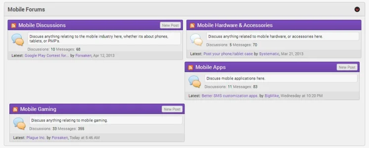
How do the subforums perform? I noticed that you don't have any on display.

Another minor grievance (perhaps this is by design) the selected tab and hover at the top falls a few pixels short.

Signup/login button in sidebar the border-top seems to have a different coloured border or it might actually be missing.

Node icons I won't mention I'm sure that is on your todo list.

But overall after having a longer look it's shaping up real nice.

Edit: Toggle Icon something like the colouring below. I chop and change my mind regarding colour like the British weather.

adept-toggle.webp

adept-toggle-square.webp
 
2 suggestions: 1) New node icons(which I'm sure are probably in the works) 2)Something similar to this would be cool to add, especially on the index page: http://xenforo.com/community/resources/back-to-the-top.525/

Otherwise, really love the theme :)

I was thinking of adding a back to top just been busy with the other portions of the site.

I prity much like the whole style in general (not a huge fan of dual column) but I'm liking this and I feel it has it's place imo on some areas (speaking if I had dual column). Overall, another excellent looking style, liking the node toggle feature which I knew about but i like that bumping effect the point being the attention to detail throughout is excellent.

The collapse icon however, I think it's too dark (black background red arrow) I would go with something more subtle, like a slightly darker grey and for the arrow a dark grey. Something in the region or thereabouts (for the arrow) #353535.

How do the subforums perform? I noticed that you don't have any on display.

Another minor grievance (perhaps this is by design) the selected tab and hover at the top falls a few pixels short.

Signup/login button in sidebar the border-top seems to have a different coloured border or it might actually be missing.

Node icons I won't mention I'm sure that is on your todo list.

But overall after having a longer look it's shaping up real nice.

Edit: Toggle Icon something like the colouring below. I chop and change my mind regarding colour like the British weather.

View attachment 44886

View attachment 44899

Originally I did a similar icon to the first one, but wanted to try out the black first. Will go with the red as the black doesn't fit quite like I wanted.

As far as subforums go I only have them for hubs if I can help. Given the small amount of space available for nodes it's difficult to display the subforums the way I would like properly.

The hover is one pixel off on purpose due to the top border which is a lighter red (Same as is used in the signup button).

I need to find a graphic designer to do the custom icons and other things for the site. Given the amount of work I have with this site, custom work and then working with Onimua I don't have much time to do graphics as well when I'm anal retentive down to pixels on my own graphics.


View attachment 44887

And the sidebar doesn't show on profile pages

The sidebar shows on all pages, but not all pages will have a sidebar block. Currently only the login block shows on the profile page, though that should change when I finish making global and page specific blocks.

Also need to go over and shorten/lengthen node descriptions so that they don't mis-align constantly (Which is what happened in your picture).
 
With regards to the toggle icon (not sure you even wanted to use it or like the) but I posted it (PSD) on my site in the retirement home if you wanted to use it. You can see before hand what they look like as I just installed Cedrics toggle add-on.
 
With regards to the toggle icon (not sure you even wanted to use it or like the) but I posted it (PSD) on my site in the retirement home if you wanted to use it. You can see before hand what they look like as I just installed Derics toggle add-on.
Probably going to change the headers of the categories to the black gradient, and use a red icon like you've suggested.

The header is blending too much so it makes it hard to differentiate the different sections.
 
Ahh a fellow Kairosoft Gamer! Very nice site you have there Forsaken! I am currently working on a handheld gaming site called PocketWorld and I wanted to ask what addon if any you are using for your Guides Content, whether its Showcase or Wiki. The content is very nicely organized and I have been struggling with it in XF, almost considered going to ipcontent to utilize thus features. thank you in advance.
 
Ahh a fellow Kairosoft Gamer! Very nice site you have there Forsaken! I am currently working on a handheld gaming site called PocketWorld and I wanted to ask what addon if any you are using for your Guides Content, whether its Showcase or Wiki. The content is very nicely organized and I have been struggling with it in XF, almost considered going to ipcontent to utilize thus features. thank you in advance.
We use page nodes with a HTML template I wrote for our guides.

The guides are getting an overhaul soon and we might be moving to an add-on once part of it is finished for us.

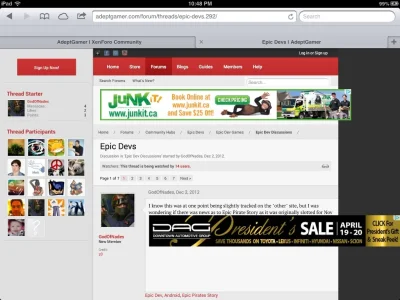
Just for you to know ,, this is how it look on ipads

That's weird... On mobile devices it should switch to a different ad format.
 
Back
Top Bottom