You are using an out of date browser. It may not display this or other websites correctly.
You should upgrade or use an alternative browser.
You should upgrade or use an alternative browser.
Lack of interest Add border radius to menu dropdowns
- Thread starter Shelley
- Start date
This suggestion has been closed automatically because it did not receive enough votes over an extended period of time. If you wish to see this, please search for an open suggestion and, if you don't find any, post a new one.
This suggestion has been closed. Votes are no longer accepted.
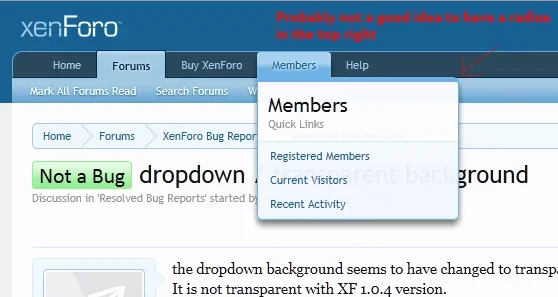
I personally would think the radius on the bottom would be quite nice small with the upper radius on the side of the menu that is not aligned with it's button could look nice with a more drastic radius. I would go further on your suggestion of the border's with removing them from one side and have it follow down into the lower radii for the side opposing the button aligned edge according to which side the drop down is aligned to like this... maybe even accentuate the shadow on the side opposing the side with the border(this case the right side) to make it stand out more.


I personally would think the radius on the bottom would be quite nice small with the upper radius on the side of the menu that is not aligned with it's button could look nice with a more drastic radius. I would go further on your suggestion of the border's with removing them from one side and have it follow down into the lower radii for the side opposing the button aligned edge according to which side the drop down is aligned to like this... maybe even accentuate the shadow on the side opposing the side with the border(this case the right side) to make it stand out more.
View attachment 19145
To be honest, I'm not at all keen on the top-left higher radius I think this should either be the same as the bottom-left/right or set to 0px if the topborder width is left at it's size. However, I like what you've done with the right side by removing the border on the right hand side but personally I would have kept the border at the bottom.TBH I think this is all about preference, what might look good on a default style may not look so good on a custom style (referring to my suggestions also). Eitherway, I'm not to fussed how this one/suggestion swings.
Another suggestion whilst I'm here. I really think the box-shadow should be lowered, less prominent. The bottom looks extremely heavy imo.
I personally would think the radius on the bottom would be quite nice small with the upper radius on the side of the menu that is not aligned with it's button could look nice with a more drastic radius. I would go further on your suggestion of the border's with removing them from one side and have it follow down into the lower radii for the side opposing the button aligned edge according to which side the drop down is aligned to like this... maybe even accentuate the shadow on the side opposing the side with the border(this case the right side) to make it stand out more.
View attachment 19145
the big radius is ugly.
dually notedthe big radius is ugly.
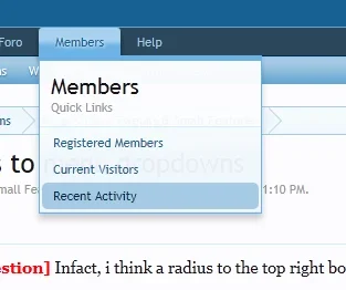
Just throwing screenshots (playing with firebug), not even sure how I feel about the one below. Since the border-width top is thicker a radius makes it look odd in the top left (top right in the other menus. So I increased the width (shown in the screenshots) so the radius doesn't appear to chop the border. Again, not even sure how i feel about the visual look. I think this might just be a case of "if it's not broken, leave it" or in my case play some more. 
I like the screenshot in your very first post. It´s nice.
Probably having the radius only a bit smaller? I think it would look great if the radius is the same size as the radius being used for the navigation-buttons (e.g. the "Members"-button when you hover over it).
Probably having the radius only a bit smaller? I think it would look great if the radius is the same size as the radius being used for the navigation-buttons (e.g. the "Members"-button when you hover over it).
I like the screenshot in your very first post. It´s nice.
Probably having the radius only a bit smaller? I think it would look great if the radius is the same size as the radius being used for the navigation-buttons (e.g. the "Members"-button when you hover over it).
Imo if you were to introduce a radius in the top-left and have it lowered than the ones on the bottom left/right that would still look odd if you don't increase the top border-width. I'd probably suggest that if the radius is applied and the top border-width isn't increased then just apply the border -radius to the bottom left & right and possibly lower the box-shadow. If the top borderwidth was increased then by all means i think a top-left radius would look better and wouldn't have that appearance of being chopped, if that makes any sense.
Edit: I think we need one of the devs to come in and say we will leave it for now.
I mean, the radius should be visible as radius, but it should not be that big. A smaller radius looks more elegant.
Probably same radius-size as we have in the pink-box when you quote a post (maximum 4px) ?
Ah I gotya.
BTW: the reason I mention about lowering the box-shadow is because it really drowns out the bottom-border, I think lowering this significantly highlights the bottom-border better thus highlighting the menus.
Similar threads
- Replies
- 1
- Views
- 453
