XF 2.2 About Profile on Mobile View

MapleOne

Well-known member
Screenshot - 2022-12-18T200647.815.webp


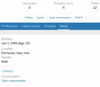
I'm finding the ABOUT tab leaves a lot of space on mobile.

In the picture above there is still plenty of room to display Birth date beside Birthday:

Same for the other lines.


Where do I find the code part that controls that?
I think it breaks the line up a bit early for my taste and on most of the new phones with the larger screens this looks odd.

 
Frankly, I don't find it a shocking layout, and this empty space is only significant on a few configurations, probably tablets or smartphones in landscape mode. Moreover I do not imagine a member of your forum to even make the remark on this subject, it is so insignificant in my humble opinion.
 
Actually...

Most visitors (according to google) are now via mobile.

I have a user verification in my marketplace so users are encouraged to make sure member profiles have real information before conducting commerce.

The about tab has lots of info and on mobile looks like it was thrown together instead of how nice and fluid the rest of the site is.

All I really need is to set the line break a little larger and it should fix it nicely.

The vast majority of newer phones have larger screen sizes now and that is probably different from when this setting was implemented.
 
Where do I find the code part that controls that?
Haven't tested it but try placing this in your extra.less template

CSS:
@media (max-width: @xf-responsiveNarrow) {
[data-template="member_about"] .pairs.pairs--columns {
    display: flex;
}
[data-template="member_about"] .pairs.pairs--columns.pairs {
    >dt {
        width: auto;
        padding-right: 0;
        margin-right: 5px;
    }
}
}
 
Code:
@media (max-width: @xf-responsiveNarrow) {
[data-template="member_about"] .pairs.pairs--columns {
    display: flex;
}
[data-template="member_about"] .pairs.pairs--columns.pairs {
    >dt {
        width: auto;
        padding-right: 0;
        margin-right: 5px;
    }
}
}


should be .dt right?

I tried it both ways, no difference
 
Use custom_fields_macros instead of member_about
In custom_fields_macros template add a class to <div class="{$wrapperClass}"> like <div class="{$wrapperClass} dnca">

In extra.less template
Less:
.dnca {
    display: flex;
    flex-wrap: wrap;
}

[data-template="custom_fields_macros"] {
    .pairs.pairs--columns.pairs {
        width: 50%;
    }
}

Try to see.
 
Last edited:
That changes it for desktop too right?

The field name and description would easily fit into one line, is there no way to do that instead?

Notice the massive white space on the right on mobile

Screenshot_20221219-143518.png
 
Top Bottom