You are using an out of date browser. It may not display this or other websites correctly.
You should upgrade or use an alternative browser.
You should upgrade or use an alternative browser.
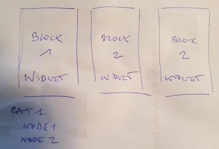
XF 2.0 3 widgets horizontally aligned
- Thread starter kankan
- Start date
Ok. How about the css? They all have .gridHi @Justwise
remove one of this from the code:
Code:<div class="grid"> <xf:widget key="forum_overview_share_page" /> </div>
Then in code<div class="grid">for other two widgets add extra classes like<div class="grid class1">and<div class="grid class2">, for instance.
How will I edit the 2 different class in the css?
ForoOposiciones
New member
Hi
The solution is great. The problem is that it duplicates the Widget, places them inside the grid and outside (where its natural position is indicated) Any solution?
The solution is great. The problem is that it duplicates the Widget, places them inside the grid and outside (where its natural position is indicated) Any solution?
Ferdinand
Well-known member
Anatoliy
Well-known member
Well, I was so happy last night, but today after looking in details on my creation, I understand what a mess I created. )
@BassMan would you guide me please, when you have a minute?
So here is how I was thinking. xF has fixed 1200px width, I have 3 columns, so I need 400px width pictures. And for mobile screens 400px is kind of ok, so I started to dance from 400px width. And here is my first question. I use windows, but 55% of my visitors are oh IOS or Mac. And I heard some about that retina thing. So I better use 800px width that will resize by browser & css? Or...? Please advice.
Mr Lucky
Well-known member
Less if you take padding and space between into accountSo here is how I was thinking. xF has fixed 1200px width, I have 3 columns, so I need 400px width pictures.
Yes, larger pictures reduced do look better on Retina, so I useAnd for mobile screens 400px is kind of ok, so I started to dance from 400px width. And here is my first question. I use windows, but 55% of my visitors are oh IOS or Mac. And I heard some about that retina thing. So I better use 800px width that will resize by browser & css? Or...? Please advice.
max-width:400px or whatever display width you want. It's not a deal breaker, they just look a bit sharper.
Last edited:
Anatoliy
Well-known member
gotcha. thanks!Less if you take padding and space between into account
Yes, larger pictures reduced do look better on Retina, so I usemax-with:400pxor whatever display width you want. It's not a deal breaker, they just look a bit sharper.
Anatoliy
Well-known member
I actually set pix as bg in .grid and appliedTypo fixed max-width
background-size: cover;
height:200px;
edited to add: yes, 2x images look way better. ) thanks again!
Last edited:
Anatoliy
Well-known member
So I got so excited about ability to put things in 3 columns that I decided to put forum nodes on forum list in 3 columns too. And got stuck...
I go to node_list_category. Do I add grid-main class to the div on 2nd line or on 4th?
And what div should I add class grid?
Help! )))
I go to node_list_category. Do I add grid-main class to the div on 2nd line or on 4th?
Code:
<xf:macro name="depth1" arg-node="!" arg-extras="!" arg-children="!" arg-childExtras="!" arg-depth="1">
<div class="block block--category block--category{$node.node_id}">
<span class="u-anchorTarget" id="{$node.Data.getCategoryAnchor()}"></span>
<div class="block-container">
<h2 class="block-header">
<a href="{{ link('categories', $node) }}">{$node.title}</a>
<xf:if is="{$node.description}"><span class="block-desc">{$node.description|raw}</span></xf:if>
</h2>And what div should I add class grid?
Help! )))
Lukas W.
Well-known member
XenForo template syntax cannot achieve that out of the box. You can either duplicate the content and hide it with a css media query in the appropriate spot, or supply your backend with a device discovery method.Hi @BassMan. This is amazing, Thank you!
Just one question in which I hope you can help.
What kind of <xf:if> would I need to add to the code to achieve the following:
Desktop - Box above nodes
Mobile - Box below nodes
DaveL
Well-known member
Ah that's a shame, but thanks for the headsup. Think i'll leave it as it is for the time being!XenForo template syntax cannot achieve that out of the box. You can either duplicate the content and hide it with a css media query in the appropriate spot, or supply your backend with a device discovery method.
DaveL
Well-known member
Evening,
So i've managed to get this to work, however i'm having some trouble working out how I add a different background image to each of the three boxes.
In my widget I have
and in my extra.less I have
Which piece of code in the extra.less corrosponds to box 1,2,3 so I can add the background in?
So i've managed to get this to work, however i'm having some trouble working out how I add a different background image to each of the three boxes.
In my widget I have
Code:
<div class="grid-main">
<div class="grid">
<xf:widget key="xfrm_overview_top_authors" />
</div>
<div class="grid">
<xf:widget key="xfrm_whats_new_overview_new_resources" />
</div>
<div class="grid">
<xf:widget key="xfrm_stats" />
</div>
</div>and in my extra.less I have
HTML:
.grid-main {
display: flex;
}
.grid {
display: flex;
flex-direction: column;
flex: 1 1 250px;
margin-left: 2%;
}
.grid:first-of-type {
margin-left: 0;
}
.grid .block, .grid .block-container {
    height: 100%;
}
@media (max-width: @xf-responsiveMedium)
{
.grid-main {
display: inherit;
}
.grid {
margin-left: inherit;
}
}Which piece of code in the extra.less corrosponds to box 1,2,3 so I can add the background in?
kankan
Well-known member
Helloso I can add the background in?
All your widget refers to the same CSS property : grid
I would create extra class grid2, grid3 and set custom background properties for each box.
Last edited:
Similar threads
- Replies
- 4
- Views
- 551
- Question
- Replies
- 4
- Views
- 547
- Question
- Replies
- 0
- Views
- 225
- Replies
- 7
- Views
- 361
- Replies
- 1
- Views
- 543


