• This forum has been archived. New threads and replies may not be made. All add-ons/resources that are active should be migrated to the Resource Manager. See this thread for more information.

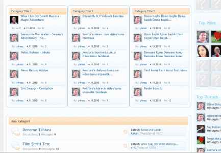
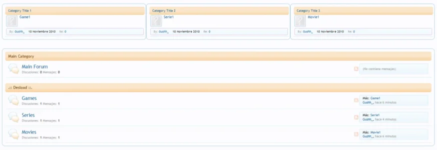
3 separate block under the navbar

yilmaz

Active member
3 separate block under the navbar.
Each block takes for a separate forum topic.

To install:

Download and unzip to your drive.

After uploading, to verify, you should have: yourXF/library/Yilmaz/Block/...

Log in to your Admin panel:

Admin -> Add-ons -> Install Addon. Click the Install from Upload file button, and browse to the location you unzipped this Addon in, and click the addon_yilmaz_seckat_konu.xml file. Once you selected the file, click the Install Add-on button.

Template Edits: Yes
Admin CP > Appearance > Templates > Search for forum_list > Click forum_list to edit it

Search the template and find:
HTML:
<xen:if is="{$renderedNodes}"><xen:include template="node_list" /></xen:if>
Right above it add:
HTML:
<xen:include template="yilmaz_3xcat_blocks" />

Admin -> Options -> Yilmaz - Selected Category Block
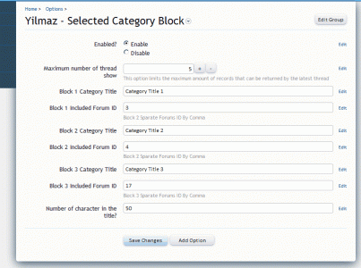
3blok-admin.gif

Cap:
3blok.gif

Thank you, Ms. Shelley has helped css
 

Attachments

uploaded the file, installed the xml file but getting the following error when making the template edit.

Code:
The following templates contained errors and were not saved:   forum_list: 1)	Line 8: Template syntax error.
 
Confirmation that Gustavo Fernandez correction fixed it.Thankyou.

It looks like some padding and margin properties are going to be needed as it all looks crammed woth spacing needed in some areas. Thanks for posting.
 
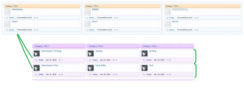
Just a suggestion. I removed a bit of css code in the yilmaz_skk.css which wasn't needed and added some more to get a more desirable visual and to give that spacing that I felt was lacking. I'd suggest replicating the layout below so that everything is organised and easily viewable for anyone installing the add-on. Just a suggestion I hope you will adopt. :)

158auzr.png
 
Just a suggestion. I removed a bit of css code in the yilmaz_skk.css which wasn't needed and added some more to get a more desirable visual and to give that spacing that I felt was lacking. I'd suggest replicating the layout below so that everything is organised and easily viewable for anyone installing the add-on. Just a suggestion I hope you will adopt. :)

Has been great.
Share here.
Thank you.
 
Here's my modified effort though I have used hex values to compliment my style.It's all in the yilmaz_skk.css template for others that want the same change.

Code:
.KateKonuBlok 
{
 padding-right: 4px;   
 }

.KateKonuBlok .avatar 
{
    float: left;
    margin-right: 4px;
}

.KateKonuBlok .avatar img 
{
    width: 32px;
    height: 32px; 
    margin: 3px;}

.KateKonuBlok .primaryContent 
{
    padding: 0;
    padding-top: 0;

}

.KateKonuBlok h3 
{
    font-size: 9pt;
    margin-bottom: 5px;
    height: 30px;}

.KateKonuBlok .kim 
{   display: block;position: 
    absolute;right: 0px;
    top: 10px;
    width: 24px;
    height: 24px;
    line-height: 24px;
    text-align: center;
    border-radius: 13px;
    font-weight: bold;
    background: @primaryLighterStill;
    border: 1px solid #dbc4e9;}

.KateKonuBlok .meta 
{   font-size: 10px;
    padding-top: 5px;
    padding-bottom: 5px;
    margin-top: 15px;
    margin-right: 3px;
    margin-left: 3px; 
    margin-bottom: 3px;   
    border: 1px solid #dbc4e9;
    border-radius: 5px;
}

.KateKonuBlok .meta dd 
{
    margin-right: 10px;
}

.KateKonuBlok .meta dd strong
{
    font-weight: bold;
}
 
Top Bottom