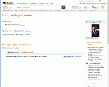
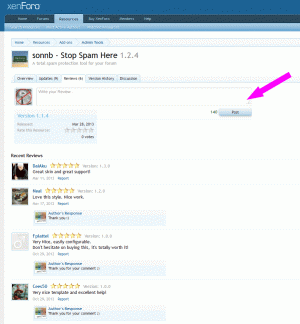
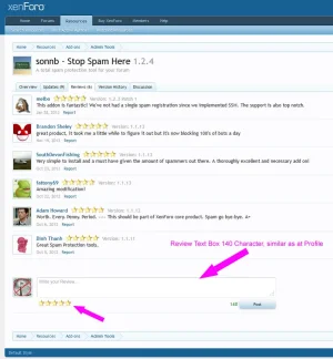
140 Char Review box for Rating-review underneath ratings

erich37

Well-known member
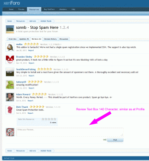
This suggestion is to place the Text-Box for the Reviews directly underneath the existing Reviews and get rid of the current pop-up window.
Just use a similar Text-Editor as we already have at the User-Profile.Pages.

If you are not an experienced XenForo-user, then it is a bit hard to figure out how to write a review.
You first need to figure out that you have to click onto the "Stars" in the sidebar (which opens a popup) in order to enter your Review-text.

It would be much more logical to directly visually display the Text-Box for Reviews.
Of yourse you are only allowed to write Reviews (enter any text) once you have downloaded the Resource, meaning "Review-permission-options" stay the same as they currently are.

reviewbox140.gif


:)
 
Upvote 8
I hope you don't mean to limit the review to 140 char ;)
You would need a big editor box to write a full review in most case.
 
this suggestion is not about the "number of characters", but to directly visually display the "Review Text Box" which makes for a better UI.

:coffee:


amazing.gif
 
So does the text editor just appear once the rating has been given?
Or would it be a page refresh?

With your mockup the text editor is visible even though a rating hasn't been made.
So would typing in it be disabled or would the user receive an error on submit?

Either way I prefer the existing implementation which is far more practical and suitable.
 
The text-editor-box should always appear and always be visible. Same as we already have at the User-Profile-pages.


It is an easy process:
You just write your full review first, then you click the stars, then you hit the "post review"-button in order to submit your review. Done.
In case you forgot to click onto the stars, you get a message (pop-up) to also click onto a star. You click onto the stars (in the pop-up) and your post gets submitted. Done.


The user needs to see the text-editor at all times in order to understand where to start off in writing a review. Otherwise nobody would know that you first need to click onto a star in order to be able to write a review.

User-Interface-Design considering human behaviour.

:)

rating_reviews.gif
 
yeah, people could just write their "Review Text" into the Editor-Box and click the "Post-button".
If a user forgot to also click onto the "Stars", they will be shown a pop-up-window which says: "Please click onto the Stars to give a Rating from 1 to 5".

It will be exactly the same as currently, just vice-versa.


Showing the "Editor-Box" is definitely more intuitive for the user........ to show him where to begin with.....


:cool:
 
Something needs to be done to address the issue of people unable to figure out how to submit a review.
I remember when RM was installed on this site, many XF site owners didn't know how to write a review for resources here so just image the regular members.
 
I think the review box should be just open and ready on the Overview tab just like when you go to someone's profile page. It's the first thing that they see and it's fool-proof.
 
Top Bottom