Responsive Design for XenForo 1.1 [Paid] [Deleted]

Make sure code is exactly like I posted above, with .sidebar on first line (small "s"), and .Sidebar (big "S") on other lines.

As for ads, check window width before triggering ad code. Something like this:
Code:
if ($(window).width() > 700)
{
   document.write('<script src="whatever"></script>');
}
I think it should work, though I'm not 100% sure.
 
Make sure code is exactly like I posted above, with .sidebar on first line (small "s"), and .Sidebar (big "S") on other lines.

As for ads, check window width before triggering ad code. Something like this:
Code:
if ($(window).width() > 700)
{
  document.write('<script src="whatever"></script>');
}
I think it should work, though I'm not 100% sure.

Thanks for the suggestion on the javascript solution, it might be a way out, but I would prefer if I could always have the sidebar displayed toggled on but displayed below content.

I copied the code directly so it is exactly as in your post, but I am using xenPorta and Widget Framework so its always possible that this is messing things up.
 
New version of add-on will be released soon to support Resource Manager (within 24 hours after RM release). I'll add options for sidebar to it.

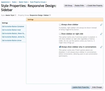
edit: added it, screenshot of new options below

sidebar.webp
 
I am spending time figuring out how to adapt my ad regular screen ad zones for phones and tablets. I am custom tweaking the different screen sizes to show different sized ad media, in different locations.

So side columns on computer screens - become 320 x 50 fixed float bottom banners on phones

I am not done yet..

I was thinking of repurposing the side column button to be a generic call to action message for an ad zone..

Not sure..
 
Is this now compatible with xenPorta? I was reading through and some posts indicated it was. The main description states it's missing some modules but should be ready within the next few days.. but the last update was 02/12/13.
 
Yes, it is.

I didn't update add-on description since it was posted here. It has support for these large add-ons:
  • xenPorta
  • xenAtendo
  • FooterPie
  • sfDirectory
  • User Albums
and some small add-ons.
 
Yes, it is.

I didn't update add-on description since it was posted here. It has support for these large add-ons:
  • xenPorta
  • xenAtendo
  • FooterPie
  • sfDirectory
  • User Albums
and some small add-ons.

And now... off I go to purchase.. hopefully it supports the addons I'm using - my style is just a modified default xenForo one. Thanks!
 
That's correct behavior. iPad is wide enough to show full forum pages
OK, on my iPad, my iPad mini, my iPhone 5 show about 1/4 bar to the right of the forum. The S3 only uses half the screen. No special settings for width adjustment in the system outside of normal. Using xenPorta and a slightly modified (colors only with some CSS edits) style.
 

Attachments

  • IMG_0118.webp
    IMG_0118.webp
    95.9 KB · Views: 18
I've checked your forum, looks like issue is caused by wide logo. That bug is fixed, but I didn't release fix for it yet because I'm waiting for ether RM or 1.1.4 to release new version, whichever comes first.

I'll send you latest xml file. Use it to update add-on, it should fix that issue.
 
I've checked your forum, looks like issue is caused by wide logo. That bug is fixed, but I didn't release fix for it yet because I'm waiting for ether RM or 1.1.4 to release new version, whichever comes first.

I'll send you latest xml file. Use it to update add-on, it should fix that issue.
Good deal... it was driving me bananas. It displayed better on the iPad and iPhone without the responsive design than with.
 
I was wrong. There is no such bug in add-on, but there was similar bug in my style. I've confused those two.

Issue is caused by logo. You've centered it using negative margin, which works great for small logos, but not for wide logos. I suggest changing method for centering logo.

Replace entries for #logo and #logo a that you have in extra.css with this:
Code:
#logo { float: none; }
#logo a { display: block; max-width: 600px; margin: 0 auto; }
 
There is another item causing same problem: ad below content. It is hidden, but div for it remains visible causing page to become wider. Your ad code is wrapped into <div align="center">. Replace that div with <div align="center" class="responsiveHide">

Also add this to responsive_extra.css
Code:
.node .nodeLastPost { white-space: normal !important; }
This was caused by the Google AdSense add-on. I have edited the actual templates, but will later edit them via TMS in case it is ever upgraded. Thanks for the help, it's working fine (other than Tapalk app notification not being able to be dismissed on the S3 - that was solved by disabling the listener).
 
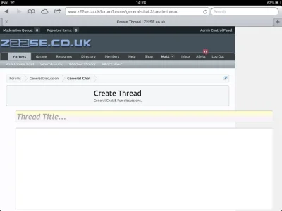
I've recently increased the width of form width from 750px to 900px, so this is now throwing out the message posting form on the iPad

2013-03-20 14.28.21.webp

Is there any way to scale this back down automatically on the iPad?
 
Try adding this to extra.css (not responsive_extra.css):
Code:
@media only screen and (max-width: 900px), only screen and (max-device-width: 900px)
{
 .xenForm { width: 98%; }
}
 
Try adding this to extra.css (not responsive_extra.css):
Code:
@media only screen and (max-width: 900px), only screen and (max-device-width: 900px)
{
.xenForm { width: 98%; }
}
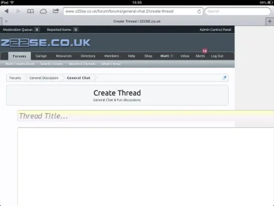
This is what it looks like now
2013-03-20 14.55.00.webp
 
Weird. Try adding this before last }
Code:
.xenForm .ctrlUnit.fullWidth dd .textCtrl, .xenForm .ctrlUnit.fullWidth dd .mceLayout { width: 532px; }
 
Top Bottom