You are using an out of date browser. It may not display this or other websites correctly.
You should upgrade or use an alternative browser.
You should upgrade or use an alternative browser.
Flexile 1.1.5.1
No permission to download
- Thread starter Erik
- Start date
- Status
- Not open for further replies.
Erik
Well-known member
Go to Flexile > Style Properties > General > Flexile Content Background and add it in the background image field.how can i add a large wallpaper as a background?
and thanks for the update")

D37
Active member
In your attachment there I see the user info like "messages, likes, and points" and the user avatar, but I don't see that updated on the latest release of the style. See my pic I just took:Flexile 0.2 has been released with support for Beta 3. I've also added a branding-free option. The price is $20. Please see the original post for details regarding the branding-free option.
Here is the changelog for Flexile 0.2:
Jamie, I didn't include a fix for that in the latest update but I'll look into it.
- Updated for Beta 3. Templates updated and modifications tweaked to fit current XenForo techniques.
- Made spacing consistent accross entire theme.
- Updated text shadow on secondary nav bar rollover to use RGBA values and made slightly more transparent for better readability
- Made search bar rounded for sexiness and added inner shadow.
- Added style property to control background of main content area (General → Flexile Content Background). The background of the header can be controlled by the "Header" style property, and the background of the footer can be changed by modifying the "HTML" style property.
- Made the background of the Login dropdown layer the same as the User Bar's background for consistency.
- Added Style Properties to enable/disable the mini avatar in the user bar, and the sidebar user card that exists in the default style but is hidden by default with Flexile.
- 2 new small features:
- Added the ability to display a simple link in the left-side of the user bar for normal users, to fill the space where the moderator/admin controls are located for mods/admins. This can be controlled via Style Properties.
- Added a "content box" that is displayed on the right side of the header where you can add some custom content to highlight something important. This too can be completely controlled via Style Properties.
- Here is a picture of the 2 new features together:
View attachment 6326- All colors shown in the first post are now included in the package by default. To use them, you will need to import each individually as a child of the base Flexile theme.

Nasr
Well-known member
In your attachment there I see the user info like "messages, likes, and points" and the user avatar, but I don't see that updated on the latest release of the style. See my pic I just took:
View attachment 6367
You have to enable it from the "Flexile Style Properties"
D37
Active member
Ok thanks, how?You have to enable it from the "Flexile Style Properties"
Nasr
Well-known member
Ok thanks, how?
Styles->Flexile -> Style Properties-> Flexile Style Properties -> Show User Card
Erik
Well-known member
Yes. search-bg.png under the xenforo/gradients folder.Thank you very much Erik. Are there any new images to upload?
Erik
Well-known member
Thank you for this style
I have one problem with XenMedio and this style, please, look the screen:
View attachment 6365
Do you idea for fix it ?
In the public.css template, add the needed classes to this list:
Code:
#content.forum_list .pageContent,
#content.news_feed_page_global .pageContent,
#content.member_list .pageContent,
#content.online_list .pageContent,
#content.conversation_view .pageContent,
#content.report_view .pageContent {
In breadcrumb.css, do the same thing for these:
Code:
.forum_list .breadBoxBottom,
.news_feed_page_global .breadBoxBottom,
.member_list .breadBoxBottom,
.online_list .breadBoxBottom,
.conversation_view .breadBoxBottom,
.report_view .breadBoxBottom {
and these:
Code:
.forum_list .breadBoxBottom .breadcrumb,
.news_feed_page_global .breadBoxBottom .breadcrumb,
.member_list .breadBoxBottom .breadcrumb,
.online_list .breadBoxBottom .breadcrumb,
.conversation_view .breadBoxBottom .breadcrumb,
.report_view .breadBoxBottom .breadcrumb {Erik
Well-known member
Okay... so I dont forget... and in case anyone else wants to know what I did...
Code:.navTabs .navTab.PopupClosed .navLink { -webkit-box-shadow: black 0px 0px 5px; color: @lightTextColor; background: rgba(0, 0, 0, 0.5) url('@imagePath/xenforo/gradients/navigation-tab.png') repeat-x 50% 0%; height: 25px; line-height: 25px; margin: 5px; padding: 0px 10px; }
Can I make some more recommendations?
I like that you took my advice about consistency between the margins... but I think you took it a bit too far. While being consistent with the top and margin bottom was good; I think applying that same consistency to the margin between the main content and the sidebar is just a bit too much. Putting 20px of width between every main body element is just a complete waste of space... The idea of a LARGE margin is to separate unrelated content; the header, maincontent and footer are all unrelated. However, the main content and the sidebar are related content; they should have a SMALL margin. Its like the difference between using a period (.) or a semi-colon (in your sentences.
I lowered the difference between them to 10px and I think it looks a lot better:
http://xen1.8wayrun.com/media/
As well, the roundness of the search bar? Not sexy at all... and, not consistent. Almost every rounded element in the style has a radius of 5px... but the search bar has a roundness of 11px. When I first loaded the skin, my eyes immediately stuck directly to the search bar and it was very jarring. Especially since there are white pixel artifacts around the radius border. I've changed it to 5px on my forums and I think it looks a lot nicer.
I agree with you on the search field, but not on the spacing. I think 10px is not nearly enough. I might try 15 for the next version.
Luckily, you can change them to whatever you want.And, just a tip for anyone making any modifications to the style. I recommend you rename the Flexile Style to something like "Flexile Original", make it unselectable by users, and then create a child style named Flexile and update that with your modifications. This way, when a new version is released, all you have to do is update the Flexile Original style, and any updates will be inherited to your modified version.
Peggy
in memoriam 2016
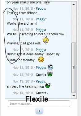
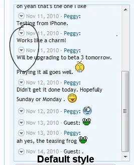
Erik there seems to be an issue between Flexile and the Taiga Chatbox addon. In the chatbox, the circle/arrow for xf is not showing where it's supposed to. I'll add the same screenshots here that I did over on the chatbox thread. There is a space where it's supposed to be, but it's not there, which is odd because since Flexile is installed as a child style of the default they should appear where they're supposed to since they do appear correctly in the default style.
Any ideas?
Any ideas?
Attachments
Peggy
in memoriam 2016
oooooook I can see what's going on now. Flexile calls for these two images, simple-arrow-up.png and simple-arrow-down.png, in place of XenForo's circle-arrow-up.png and circle-arrow-down.png.
I've been looking for these images in the flexile sidebar templates, but can't find them!The reason I've been searching only the sidebar templates is because the circle -arrow images appear just fine everywhere else in the style, except the sidebar.
Any hints?
I've been looking for these images in the flexile sidebar templates, but can't find them!The reason I've been searching only the sidebar templates is because the circle -arrow images appear just fine everywhere else in the style, except the sidebar.
Any hints?
Erik
Well-known member
You can adjust this if you wish by dragging the hue slider for the secondary group of colors to your desired hue:Very nice. Upgraded and imported all color for user selection.
One suggestion: The Node category area and quoted text background remain constant, should be adjusted to be harmony with primary color.
Thank you.
http://xenforo.com/community/threads/flexile-updated-for-beta-3.7164/page-2#post-101815
Peggy
in memoriam 2016
Erik I seem to be having an issue with the forum status icon colors. When someone makes a post... in Firefox (latest version), the icon color doesn't change like it's supposed to, to indicate that there's a new post. But in IE7 it does change color.
Is there an issue with FireFox?
Is there an issue with FireFox?
- Status
- Not open for further replies.
Similar threads
- Replies
- 0
- Views
- 291
- Replies
- 1
- Views
- 613
- Replies
- 5
- Views
- 960
- Replies
- 19
- Views
- 2K
- Replies
- 9
- Views
- 3K