XF 2.1 Why is the "What's New" so complicated and is there an easy way around it?

Most users want a simple list of New Posts.
At most, they want two lists "New Posts" and "unread posts"

But the XenForo 2 makes it really complicated

On the main page, instead of being able to click on the above, one has a choice of

a What's New Tab
And 203519

But clicking on the What's New Tab gives you 8 items to read, many of which are duplicated. ( We have done some customisation, so I can't remember what the original was but it's at least 6 items.) Who on earth wants to read "New Profile POsts"?
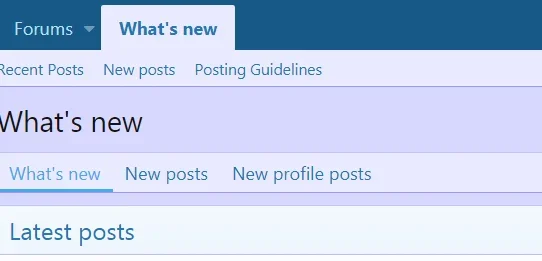
203520

Why not scrap the "What's New" tab completely and put "New Posts" and "Unread Posts" on the Forums Tab?

In fact, you wouldn't even need a forums tab if you did that.

Brendan
 
Yes, but that is just the thing: you cant see all that is new on the whats new page. It hides new content if there are more than x new entries and it shows old content if there are less than x new entries in a block.
This is a more accurate overview of new content:
Especially if you tweak the css to hide trivial elements and make it look similar to new posts.
It also doesn't arrange content in an easily readable fashion. It's like a very old-fashioned approach to making a facebook or twitter news feed.
 
If I only want to see new posts I use New posts.

Hi HRC

How do you get to New Post?

Looking at this XenForo forum that we are on
1) Click on What's New
2) This presents you with this
203602

You have to search through this to find "New Posts" which is in two different places. There is so much other distracting stuff for example "What's new" is there again and duplicated for good measure"
3) Having found New Posts, you then click on it

Why not have a simple Button "New Posts" on the top line?
One click brings you to it.

Instead of click, search and click again.

Brendan
 
Why don't you just do it yourself?

That takes 2 minutes, problem solved.

Ah, I hadn't realised that I could do it myself.

I have upgraded recently and haven't figured out that stuff. I assumed that this layout was hard wired.

I will figure out how to zap the What's New Tab and put in a New Posts tab in its place.

Brendan
 
Ah, I hadn't realised that I could do it myself.

Okay, I understand that up to a point.

Many others might want it that way.

When you buy software that was programmed for a lot of people, you probably have to compromise.

As I said, it's no problem to change that yourself.

And actually the Link What's New does exactly what it's supposed to do. It shows the user EVERYTHING that is new.

If you don't want that just link to New Posts
 
I will figure out how to zap the What's New Tab and put in a New Posts tab in its place.
On your test site you'll want to play around in ACP => Setup => Public Navigation to see the menu options. If you then click on the "What's new" menu category you'll see where it goes currently and you can change it.

For me I prefer the "New Posts" tab being the default so by changing "What's new" link value to {{ link('whats-new/posts') }} the end result is that the menu is still present but clicking on it directly will default to the New Posts tab in the results.
 
New Posts are PITA for me. No matter how many times you tell em, only a few of my members (seniors) get it. The most recent/latest post in a forum won't be seen if they have already looked at it, even though it is the newest post. :doh:

All new post links of mine now point to whats new.
 
Top Bottom