Luke F
Well-known member
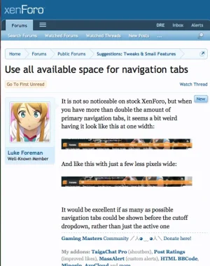
It is not so noticeable on stock XenForo, but when you have more than double the amount of primary navigation tabs, it seems a bit weird having it look like this at one width:

And like this with just a few less pixels wide:

It would be excellent if as many as possible navigation tabs could be shown before the cutoff dropdown, rather than just the active one

And like this with just a few less pixels wide:

It would be excellent if as many as possible navigation tabs could be shown before the cutoff dropdown, rather than just the active one
Upvote
9


