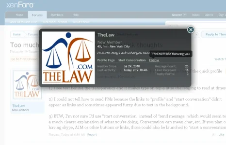
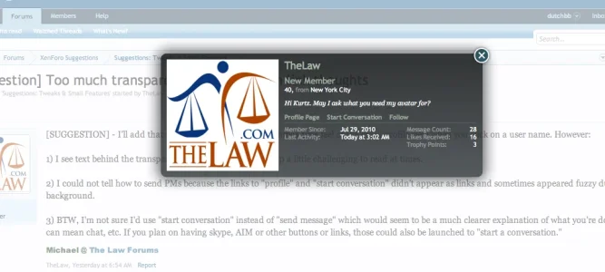
I love the lightbox type feel of the quick profile view when you click on a user name. However:
1) I see text behind the transparency and it makes type on top a little challenging to read at times.
2) I could not tell how to send PMs because the links to "profile" and "start conversation" didn't appear as links and sometimes appeared fuzzy due to text in the background.
3) BTW, I'm not sure I'd use "start conversation" instead of "send message" which would seem to be a much clearer explanation of what you're doing. Conversation can mean chat, etc. If you plan on having skype, AIM or other buttons or links, those could also be launched to "start a conversation."

