The Lower World

With a new project in hand and seeing a niche that I knowingly could get into I started work on The Lower World. A forum based role-play that is tied into the game The Secret World. A place for role-players to come and not worry in scheduling time to meet in game. To truly let the creative process take hold and expand their characters story.

logograb.webp
Customizing Audentio's UI.X theme which is completely easy to work with and so smooth. Went about in adding the Resource Manager for a members to share their designs, maps, or even with the newly user generated text based adventure games that are now available to be played in game. We also use The Showcase mod that fits perfectly to having members create their characters to be seen and shared.
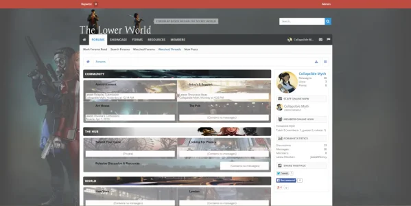
TLW Index.webp

I just opened it today to general registration, let me know what you guys think. Any issues, complaints, or bugs that haven't fully squashed yet.

Website: http://www.lowerworld.com
 
Last edited by a moderator:
Now there's a link . . . . okay.

At first glance the node images appear stretched/distorted, so I'm guessing they weren't sized accurately. Soloman Island... is spelt Solomon Islands (I'm assuming you're using real places based upon London, New York, etc)

There's not enough happening to comment on much else - so good luck :)
 
I actually re-sized the images down and cropped them to fit within the node area. The originals are much larger and wanted to get the action portrayed within them to show. First time in really working with the CSS and getting things to line up and look good. I'll have to work on the images, maybe do some experimenting with hover effects and such.

With the naming its actually the different maps from within the game :) The different areas that are playable.

I know and with some luck that'll change soon. Wanting to keep growth organic and not have a lot of one or two post members from some posting service. Thank you for the bit of advice @Azhria Lilu
 
Made quite a few changes to the site since we've opened. Had a new logo designed and worked in offering three different styles that members can select from that portrays each of the in-game factions colors.

TLW_Dragon.webp
TLW_Illuminati.webp
TLW_Templar.webp

Also have been working on taking care of the node images in trying to make them not appear stretched out and looking bad, so far have done the nodes within the "World" section and will continue to improve the rest of the images in the other sections as well. Been busy in slowly improving things and would love to hear your thoughts on what has been done so far. :D
 
Recently have gone through in changing the look of the site to something a bit less busy feeling. I've been working on the style design and thought with a different image for each node came across as too much.

We've also opened our resource section to everyone and still looking for critques :)
 
For me, the style as it stands is very bland. I don't like the silvery (brick?) background image used on all the nodes but I do like the single one that stands out on the Roleplay Discussion & Resources node. The logo is a bit on the small side but that's personal preference - I'd possibly ditch the woman and the fire and just go with the text logo. The rest of the style looks mostly default (and way too white).

One thing that I do want to comment on :-
foooter.webp

What is the "another level"? You need to sell yourself more in this - the About Us tells us exactly nothing. And the seemingly randomly placed animated Top RP Sites really doesn't inspire confidence for me . . it makes me think of all those ezboard/yuku sites which have these images plastered all over the place.
 
For me, the style as it stands is very bland. I don't like the silvery (brick?) background image used on all the nodes but I do like the single one that stands out on the Roleplay Discussion & Resources node. The logo is a bit on the small side but that's personal preference - I'd possibly ditch the woman and the fire and just go with the text logo. The rest of the style looks mostly default (and way too white).

One thing that I do want to comment on :-
View attachment 79133

What is the "another level"? You need to sell yourself more in this - the About Us tells us exactly nothing. And the seemingly randomly placed animated Top RP Sites really doesn't inspire confidence for me . . it makes me think of all those ezboard/yuku sites which have these images plastered all over the place.

Thank you for this awesome critique as it does point out a lot of things that looked good on paper when I started it but in actual use turned out to be not good. I admit when I was moving from the many differing node background images I had my doubts but figured in that a more unified look would be better. Looking at it now I can see in that it lost a lot of the personality we originally wanted.

With the logo I wanted something easily recognizable and didn't call the attention of the visitors eyes as much with an overlay huge one.

The About Us is something I'm going to strike out and start from scratch on again and for the Top RP Sites I'll probably move it out or to create a side widget with the linking as I do plan on offering an affiliate section with small banners to other role play sites and resources.

I'm learning a lot since taking over things and experimentation is something that I'm enjoying and loathing at the same time :) Right now I've gone back to the previous style layout I had and making changes to it only have come up against some roadblocks that I'm waiting on replies to my posts in the UI.X thread.
 
Has been several months and have gone through in furthering the look of the forums into something more, personal. We've already have several role play games going using Waindigo's Social Group add-on which has shown to be a very great thing to have. Easy to allow our members to open and run their own forum role play.

Would like any critiques on the new changes we've made.
 
So I have looked at this late obviously and I see that you guys have gone festive for christmas. I do like the bar at the top that follows you around every where you go. However, when you get back up to the top it seems to "glitch" back onto the top of forums. That I don't like.

Overall looks pretty good though.
 
However, when you get back up to the top it seems to "glitch" back onto the top of forums. That I don't like.
I've only encountered this happening on some occasions with Firefox but, overall it works as intended. Can you let me know what browser you used and if it happened on only one perticular section or everywhere?

Nice-looking forum. - Love the Christmas touch to your logo. Next Christmas I am going to try something similar. Overall Looks great!
Thank you :D didn't want to go way overboard and add snow and ornaments everywhere. Though I was very tempted.
 
The Lower World Update: thelowerworld.com
Been awhile since posting an update to our thread here and there has been a lot of changes made. Our member base has been steadily climbing and our small family have been enjoying all of the small touches put in place. We couldn't have done this without the awesome developers of Xenforo and each and every one of the add-on creators.
Kj0VbsFl.jpg


Moving over in using #rekt created by the great Audentio team as we were using UI.X previously. Changing over has been easy as the basic framework is the same. Had decided in going this route to give a more professional appearance. Even though we are a role playing site based on a game, we wanted visitors the impression right off in that role play is foremost and not a game information site.

4DAzyNKl.png


Showcase is a great addition that has been in since the beginning of the forums. Our members have been adding their characters and I'm constantly amazed in how perfect @Bob has crafted it together to be an easy to use resource for our members.

830aDiEl.png


The backbone to our role play system for our large scale role play plots is handled by @Nobita.Kun and the Social Group add-on. We've worked through a few other systems and our members have been enjoying the easiness of it. Very pleased in how each "group" is set within a grid and to have the featured slider is just a cherry on top of it all.

QOQ6sdJl.png


Another great addition that is proving to be an invaluable addition is our wiki, powered by Vaultwiki. It is the easiest of use by our members. Not having to learn yet another system in creating a wiki entry is a very big plus. One of our members was delighted to find that certain keywords were automatically linked to the wiki entry, saving her hours of work.

DXLmLILl.png


Just some of the add-on's we use to help make our members time on our site that much more enjoyable. Wanting to give a special thanks to @Sheldon in taking it upon himself in crafting a pretty sweet logo :D
 
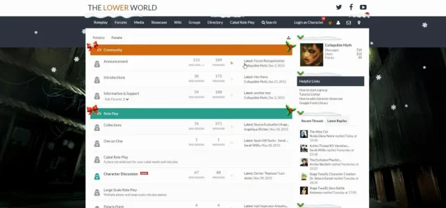
Decided in unwrapping our new theme before Christmas :D

2015-12-10_21-55-08.webp

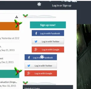
Went with @Russ over at Pixel Exit and purchased Font Awesome+. Also added his Holiday Joy add-on to give the site that nice holiday feel.
 
Back
Top Bottom