Take a look at our tiny sports board, newly on XF!

It kind of surprises me it bothers anyone, especially on mobile where it is minimized greatly.

It doesn't bother me at all, it's your forum and you can do what you like. I was just giving feedback about what it looks like to me. I saw it was a sports forum and assumed maybe it was the wall of the stadium. If it has some other meaning to those in the know that is great, that transcends any aesthetic values.
 
It doesn't bother me at all, it's your forum and you can do what you like. I was just giving feedback about what it looks like to me. I saw it was a sports forum and assumed maybe it was the wall of the stadium. If it has some other meaning to those in the know that is great, that transcends any aesthetic values.
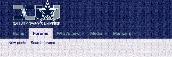
Well, I meant "bother" as in, eyesore. Not emotionally "bothered" in any way. I really appreciate all the feedback, keep it coming. It's a challenge to work in something different without it taking away from the user/visitor experience and without it looking garish or gaudy.
 
Thanks you guys. Nice to see one can make something so uncluttered and clean right "out of the box," but still add style.
xenForo is quite clean and uncluttered and I really wanted to carry that over. So, what we get to start with is already outstanding.
 
I like how it's a simple uncluttered clean design compared to what I normally see. Is that a third party or custom theme or skin, or is that something you can set with standard options right out of the box?

actually Manster54 made it...

He did great job on it...

Thanks to him!!!!

I am the owner of the website itself.
 
I didn't even notice the texture in the navbar last time and just saw this alert. I went back and I saw it and I thought it could be better. In my opinion, this looks good:
195510

vs. what you have now

195511

If you didn't set a background in your styles editor (or did but put a background image), this css in extra.less should fix it to look like the picture above if you can't get into the style editor and find the options to make the color changes the better way.

CSS:
.p-sectionLinks { background: #f5f5f5 !important; }
.p-nav-list .p-navEl.is-selected .p-navEl-link { background: #f5f5f5; }
 
I didn't even notice the texture in the navbar last time and just saw this alert. I went back and I saw it and I thought it could be better. In my opinion, this looks good:
View attachment 195510

vs. what you have now

View attachment 195511

If you didn't set a background in your styles editor (or did but put a background image), this css in extra.less should fix it to look like the picture above if you can't get into the style editor and find the options to make the color changes the better way.

CSS:
.p-sectionLinks { background: #f5f5f5 !important; }
.p-nav-list .p-navEl.is-selected .p-navEl-link { background: #f5f5f5; }
Yeah, it was blank white originally. I added the bg in the nav options. It's easy to take back out, no extra slip-in code needed.

But... You didn't notice it at first. Means it's subtle enough not to be an issue. I am sure if the owner gets some complaints he'll think about changing it. Only desktop users ever see it anyway and there's few of those on the site. Most all of them are on mobile.
 
actually Manster54 made it...

He did great job on it...

Thanks to him!!!!

I am the owner of the website itself.
I believe the styling is a big improvement over what it had on vb when you bought it. xF is a far superior platform and I'm glad you gave me the incentive to really dig into it and study it. Probably wouldn't have, otherwise.
 
Yeah, it was blank white originally. I added the bg in the nav options. It's easy to take back out, no extra slip-in code needed.

But... You didn't notice it at first. Means it's subtle enough not to be an issue. I am sure if the owner gets some complaints he'll think about changing it. Only desktop users ever see it anyway and there's few of those on the site. Most all of them are on mobile.
Yeah, but I also didn't spend too much time reviewing it too (and was on the phone which might've made it appear different, whereas I'm on desktop now). 😁
 
Yeah, but I also didn't spend too much time reviewing it too (and was on the phone which might've made it appear different, whereas I'm on desktop now). 😁
Yep looks way different on the mobile. You might have a heart attack if you look at the menu, on mobile!
 
Yep looks way different on the mobile.
Yeah, I just looked at it again on the phone and with the sliding out left nav, I think the background works as it is unique to the team. I personally wouldn't go with a background image, but like you said, it is unique and there are no complaints, and it does set you apart. But, on the desktop, the background in the nav makes it harder to see what it is and it doesn't stand out.

I don't know if you can separate the two...
It's the white jersey in the mobile nav for the white style? I thought I'd gone with the blue there. Know for sure it is, on the blue style.

But yeah it's all about being unique without major effect on the user experience and without being gaudy or garish. It's a fine line to walk.
 
Top Bottom