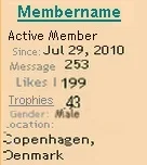
I think something just changed? because now beside each post the member's info appears with the kind of stuff that appears on their Card.
This is a nice idea but it is also space greedy.
Right now we have a long column of info on the left which leaves a huge amount of space for the message. Most messages are only a few lines often only one so this means masses of unnecessary scrolling to get through empty spaces.
One possible solution might be to have the extra info on a dropdown link "Info about"
Another might be to place the numbers for no. of Likes etc on the same line
and close up the spacing to single space like the mockup pic
- I managed to halve the size of the text info.
Pic is a bit messy but if consistently sized would look fine.

Upvote
0