Grover
Well-known member
- Affected version
- 2.3.3
Just a tiny layout thing.
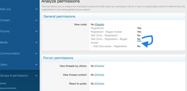
Using the XenForo ACP now properly for the very first time (I am in the process of migrating my vBulletin board to Xenforo), I am looking to the ACP through the eyes of a newbie.
At the Analyze permissions section I was at first glance slightly confused, since I could see in my case an entry called ‘Avatar:’ displayed there. Only to realise quickly that obviously this text belongs to the line above it: ‘Staf Zone - Registered - Bigger Avatar:’
The text is truncated too soon. So the whole column with Yes’ and No’s needs to move a bit to the right to create more space.
Or, alternatively at least the value (Yes or No) after ‘Staf Zone - Registered - Bigger Avatar:’ should be placed at the correct line. In this case, after the ‘Avatar’:’ text, instead on the line above it.