Simplicity [Deleted]

Unique Username

Well-known member
Malcolm Melbourne submitted a new resource:

Simplicity - Orange, Simple

Meet Simplicity!

This is my first style that I've ever made, so please cut me some slack. The design is meant to be simple, nothing too complex. I'm looking for feedback! The more feedback I get the more I can improve.

If you have a problem/bug please contact me first before posting a review. There will be many updates after this, I will try to base my updates around your opinions.

Files included upon purchase:
  • Simplicity
  • Simplicity.zip (to make it easier for...

Read more about this resource...
 
Malcolm Melbourne updated Simplicity with a new update entry:

Simplicity - Moderation Bar

We are proud to announce our first update! Simplicity v1.1.0

This update is only for the moderation bar.

Changelog:
  • Removed Visitor Tabs from Navbar and added to userbar.
  • Avatar added to userbar.
Future Changes:
  • Make it more appealing.
  • Make drop-boxes more welcoming.
  • Add a notice or a communication message.


Userbar (What regular users see)
View attachment 119334

Moderatorbar (What your admins & mods see)
View attachment 119333

Read the rest of this update entry...
 
@Malcolm Melbourne if this is your first style then you have talent for this. I dont like many styles designers make for XF. This looks appealing. Please keep creating styles.
In regards to feedback on your style, here goes. I am looking at version 1.1 now. my suggestions:
  1. Loose the green. The orange and grey / sand-white are a good colour play. Green breaks that. Try different a different colour to make notices stand out.
  2. If you choose to use rounded corners for blocks, then do that everywhere. i.e. the breadcrumb, notices, sidebar blocks, member info block on posts, post content, etc. Either go for rounded corners or not. Or make 2 styles :)
  3. There is an orange line at the bottom of the sidebar block. You do not use this anywhere else in the design, so its better to remove it or add an orange border around the entire block. Try to be very consistent in everything you do.
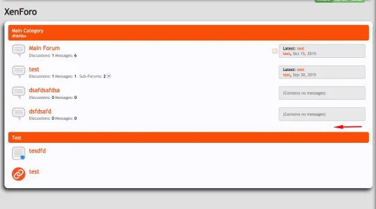
  4. The same distance between category blocks should also be below the last one and bottom breadcrumb.
  5. Make background of post content and chat content a little lighter to create more contrast. A large benefit of using grey is that its easy on the eyes, but it needs more contrast for that.
  6. Add more contrast to the footer so the text can be read.
 
You decide: Should we keep the main categories separate or should we merge them? I personally believe we should keep them separated.


Screenshot at Oct 26 01-19-32.webp
 
Updates for the style are coming soon. Updates may include:
  • Redesign of the following pages Profile page, settings, personal messaging.
  • New look for Moderation Bar 2.0
  • losing the green like @Alfa1 suggested.
  • Removing some components from sidebar and adding them to Moderation bar 2.0
More work will be expected.
 
Back
Top Bottom