Resource icon

Simple CSS Featured Thread Blocks

Shelley

Well-known member
This looks brilliant, could you possibly tell me how i could make it match my site at wirraltalk.co.uk not good on that type of thing. :(
 
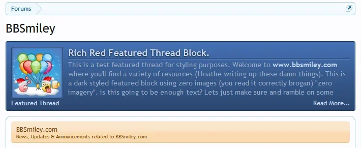
I'm not sure what colour your aiming to go for? If it's the blue variation on your default style then it's easy enough to insert the hexvalues of that colour and placing them into any one of the existing blocks to complement your style.
 
Last edited:
This looks brilliant, could you possibly tell me how i could make it match my site at wirraltalk.co.uk not good on that type of thing. :(

If the following is something like what your looking for let me know and I'll post it up and edit the release part of this resource and add the css for it.

Screenshot_19.webp
 
Ooooh yes that is perfect thank you @Shelley really looks good.

I think in the next version there will be a block appearing in the forum_view area if you choose to enable it so I'd strongly advise you change the following so when the update comes your forum_view blocks will inherit the styling.

Code:
.forum_list .sectionMain.ctaFtContainer

and change it to
Code:
.ctaFtBlock .sectionMain.ctaFtContainer

I'm about to go in and edit the resource so it complies with the new update when it arrives. Anyone else that is using this prior to this post I'd strongly encourage you to make the changes.
 
Last edited:
I think in the next version there will be a block appearing in the forum_view area if you choose to enable it so I'd strongly advise you change the following so when the update comes your forum_view blocks will inherit the styling.

Code:
.forum_list .sectionMain.ctaFtContainer

and change it to
Code:
.ctaFtBlock .sectionMain.ctaFtContainer

I'm about to go in and edit the resource so it complies with the new update when it arrives. Anyone else that is using this prior to this post I'd strongly encourage you to make the changes.
Thank you, i have just edited it. the new update sounds good, cannot wait.
 
Thanks Shelley!

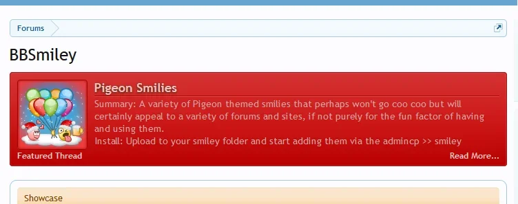
I'm using the dark version on AdEx. I tried the rich red but it's not quite right with my existing red palatte. Any recommendations for changing the hexvalues to make the reds match up better?
 
Thanks Shelley!

I'm using the dark version on AdEx. I tried the rich red but it's not quite right with my existing red palatte. Any recommendations for changing the hexvalues to make the reds match up better?

I've got some time to kill today so I might get started on some more and post them. I'll take a look at your reds on your style later and once I've done a few more I'll submit.

Screenshot_2.webp
 
I've got some time to kill today so I might get started on some more and post them. I'll take a look at your reds on your style later and once I've done a few more I'll submit.

View attachment 62938

As you might have presumed, the bright red turned out to be way too much for the Featured Threads block so I ended up going back to the dark design but with a few touches of the bright red color.

Thanks!

Is there a way to put an accent line between the Featured Thread text and Read More link similar to the line between the Featured Thread title and the body of the text? I'd be interested to see how that would look.
 
Not sure whether this will display correctly but you could try the following

Code:
.ctaFtBlock .ctaFtThreadText {border-bottom: 1px solid #232323; box-shadow: 0 1px 0 #595959;}
 
Doesn't seem to work unless I'm putting it in the wrong spot or something.

Try adding the following to EXTRA this works on my version.

Code:
.ctaFtBlock  .ctaFtFooter { border-top: 1px solid #595959; box-shadow: 0 -1px 0 #232323, 0 0 0 transparent, 0 0 0 transparent, 0 0 0 transparent ;
margin-top: 5px;}
 
It's not the same effect as the line under the Featured Thread title though. On your purple example they look similar enough, but on the dark style the difference is more obvious.
 
It's not the same effect as the line under the Featured Thread title though. On your purple example they look similar enough, but on the dark style the difference is more obvious.

Adjust the colouring slightly to compensate for the darker gradient since it starts at the bottom.
 
Back
Top Bottom