Revamped S0rethumbs Forum

Brad P

Well-known member
So my forum original forum GameTec had been live for 7 months before I run into some issus with the name being similar to other gaming forums. So I decided to make a big change for a new name domain.

The transfer was a long one and tbh damaged the community and I lost a lot of members. I spoke to fellow staff and we reduced the forums content and changed things around. Including the skin.

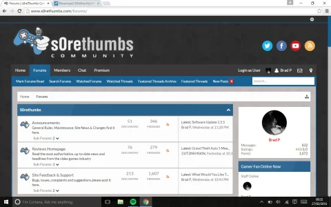
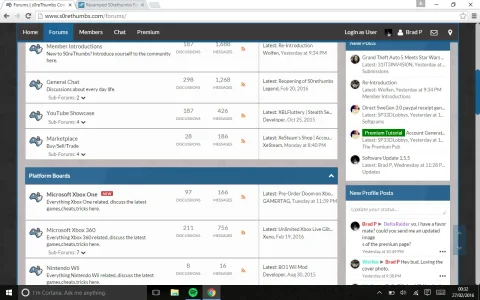
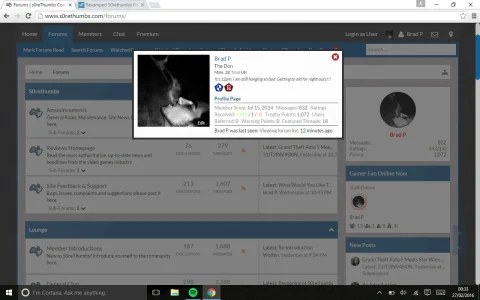
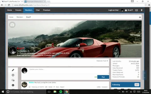
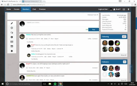
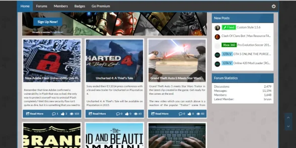
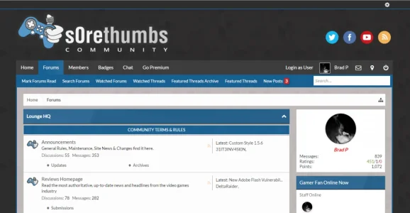
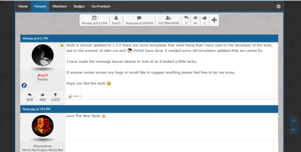
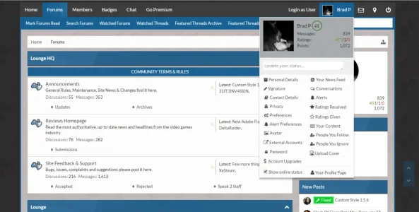
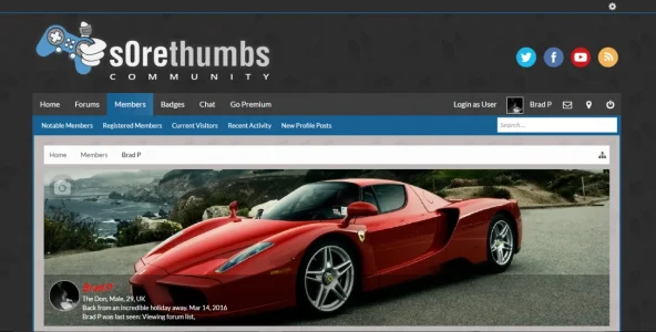
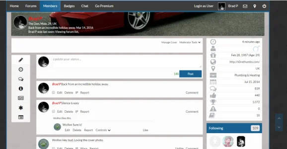
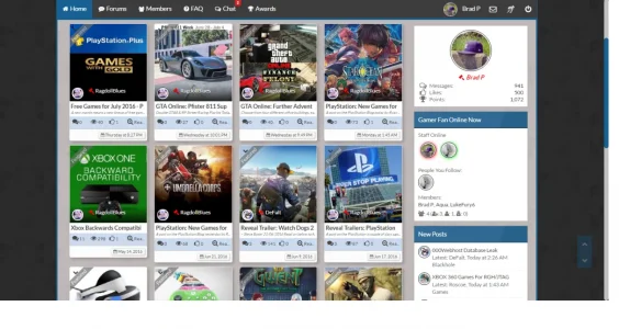
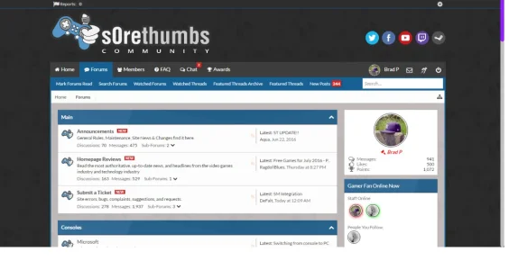
So here is the revamped http://s0rethumbs.com/ Id like the views, opinions and constructive critisism of the people on here please. Take the time to have a look around the site and let me know what its missing before i start to advertise like mad :)
 
Your fonts don't look quite right...

I notice in your CSS you have specified Evogria Italic for your headings and navigation bar.

But I am getting a substituted generic font, so the padding looks a bit off. This is how it looks for me:
sorethumbs.webp
 
When I click on your tabs ... I get a screenblanking in between loads.
upload_2015-5-15_14-59-44.webp

These tabs
upload_2015-5-15_15-0-6.webp


Anyway to get rid of it ?
Slavik's website used to do that, not sure if it still does.
 
Some new update to the site. new branding logo name, node icons,colour changes to the main board and moved members visitor panel from the sidebar into the dropdown profile.

Looking for some ideas on the top header as there is alot of white maybe some icons ??? anyway hope you like.

KUwLTLh.png


bdDr6vy.png
 
S0rethumbs has undergone a huge overhaul with a complete new style, including plenty of custom edits. would like to say a massive thank you to @Gemma for helping on a lot of edits.

anyway screenshots below, let me know your thoughts. link to website is here http://www.s0rethumbs.com/
 

Attachments

  • Screenshot (45).webp
    Screenshot (45).webp
    125.9 KB · Views: 60
  • Screenshot (40).webp
    Screenshot (40).webp
    73.9 KB · Views: 56
  • Screenshot (41).webp
    Screenshot (41).webp
    104.6 KB · Views: 56
  • Screenshot (42).webp
    Screenshot (42).webp
    69.7 KB · Views: 54
  • Screenshot (43).webp
    Screenshot (43).webp
    98.5 KB · Views: 55
  • Screenshot (44).webp
    Screenshot (44).webp
    67.1 KB · Views: 55
Been playing around with the style for a few weeks now, added move edits around the style to hopefully make it easy on the eye, would like to thank again a few people for there help and support on what is for me the sexiest looking site out there ;)

@Russ for help on edits to the site that he built/styled in the first place :)
@Gemma For the Homepage edits and previous stuff on the site, thank you so much
@Brogan for one of the best portal homepage add-ons.

anyhow please see pictures below
 

Attachments

  • homepage.webp
    homepage.webp
    84.7 KB · Views: 39
  • homepage1.webp
    homepage1.webp
    99.9 KB · Views: 39
  • mainforum.webp
    mainforum.webp
    47.6 KB · Views: 39
  • message layout.webp
    message layout.webp
    43.4 KB · Views: 38
  • visitordropdown.webp
    visitordropdown.webp
    61.1 KB · Views: 36
  • members.webp
    members.webp
    85.5 KB · Views: 36
  • members1.webp
    members1.webp
    59.7 KB · Views: 35
Some new updates to the site, introducing Font Awesome to the navbar, user visitor panel and homepage.
Any feedback would be appreciated as i am always looking to improve the site.
 

Attachments

  • Homepage.webp
    Homepage.webp
    107.7 KB · Views: 26
  • ForumPage.webp
    ForumPage.webp
    50.5 KB · Views: 25
Fantastic design. Really love the colour scheme and the news being displayed on the home page looks great. I love the little power button you are using for the login link too. Nice touch.

What add-on are you using for the home page? I see that you and @Gemma are using it.
 
Top Bottom