XF 1.5 responsive layout adjustment for avatar/user info?

TUG

Active member
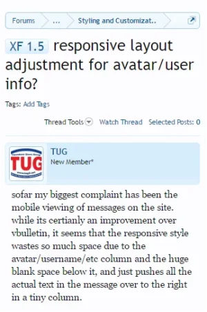
sofar my biggest complaint has been the mobile viewing of messages on the site. while its certianly an improvement over vbulletin, it seems that the responsive style wastes so much space due to the avatar/username/etc column and the huge blank space below it, and just pushes all the actual text in the message over to the right in a tiny column.

surely there is a way to adjust this? ive seen screenshots of mobile viewing that has the username/user info/avatar on top and the message spaced normally below it, but despite all my efforts i cant seem to get this accomplished.

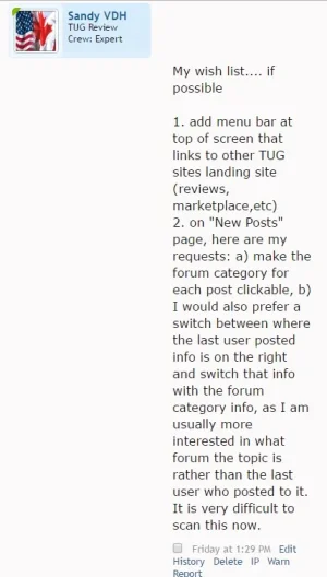
here is an example of what a decent size post looks like with the "narrow" style displayed on phones etc. more than half of the available space is wasted.mobilemessage.webp
 
That's an issue with your customised style.
In the narrow layout, the avatar and related text is above the message content.

upload_2016-11-21_16-2-34.webp

Look through the changes you have made and revert them one at a time.
 
  • Like
Reactions: TUG
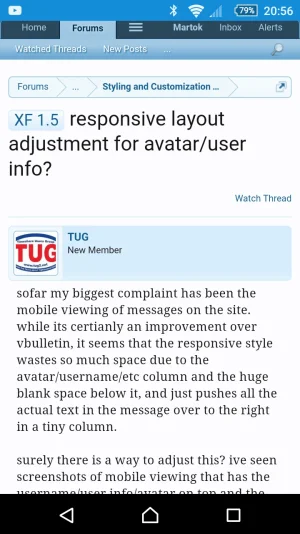
As you'll see if you view this website, it should look like this on a mobile phone:

Screenshot_2016-11-21-20-56-41.webp

You need to go to ACP >Style Properties > Responsive Design and set the various widths accordingly. The defaults should be fine but you may need to adjust them to suit your site.
 
we are on a brand new installation of vbulletin, i have not made any changes that im aware of (other than adding custom user titles and such).

what settings or modifications could have been done that would alter that?

the responsive width settings work properly, i can adjust the screen size and see them kick in at the correct levels, however none of them adjust to the way you posted screenshots on above...when it switches from (wide) to narrow, it always looks like it does in my original screenshot.
 
note i see that we have enabled some other profile information to be displayed under the user title (location, likes, etc)...is that what is causing this?
 
I would suggest creating a new style which will be like new, check the message layout in it. Something is off as it seems there is a margin on the message content and possibly a float: left; on the user info.
 
  • Like
Reactions: TUG
ah ha!

I believe this is related to the "large avatar" modification I see that one of hte admins implemented in the extra.css file. is there a command or setting that one can put in the extra.css file so that it only enables those settings on the regular desktop style (ie above 976px)?
 
Check those setting I suggested. Also look in customised components in the ACP to see what has been changed in Style Properties.

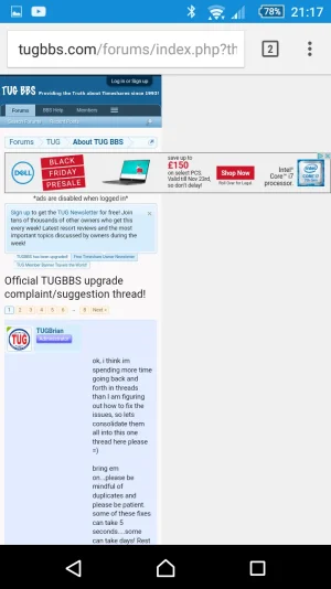
Note that (although probably not related) you'll need to sort out your advertising as it breaks out of the forum:

Screenshot_2016-11-21-21-17-04.webp
 
  • Like
Reactions: TUG
Top Bottom