I think we all like our profiles and also like customizing them. Having a beautiful profile shows a little how we feel and makes that space "a little bit of us". I think it's the same feeling with our desktop wallpapers.
Fortunately in Xenforo we can customize our covers, but I think it could stand out a little more, don't you?
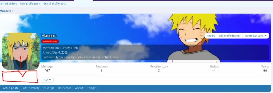
I think there's too much information, too many elements on our profile cover.There ends up being less space left to enjoy the beautiful cover photo that users sometimes add, matching their profile photos.
My suggestion is to increase some profile page customization possibilities or change it so that the covers gain a little more prominence.
- The Avatar could be a little lower. At least on my forum it appears a little higher. I didn't find an option in styles > styles properties > member profiles to adjust the height where it would be located in relation to the cover. The intention is to go down a little further to where there is space, further down.

The "Report, Edit Profile Banner, Moderator Tools" profile options are always appearing, even when we don't need them. It would be interesting if these options were invisible and only faded in when we hover the mouse over the cover, revealing the extra options. This way, less content will be on the cover when we don't have the mouse over it.

It would also be interesting to increase the size of the displayed cover. I would like to increase the height of the cover a little. There must be an option to do this, but I didn't find it (if not, here's the suggestion).
And finally, this suggestion comes from when I had tested Invision Community before Xenforo. I found it amazing that there, when you click on a user's profile cover, there is an adjustment animation that shows the complete image. When you click again, the cover returns to its place and the profile is reordered. All in fluid animation. I think it would be a cool and beautiful feature to add to Xenforo. This way we could see a complete cover photo without having to "right click and open the image in a new tab".
The part where the title, Location, and last seen appear could perhaps appear somewhere else below. Perhaps this adjustment would fit better if the profile was navigable via a sidebar. There could also be an option to choose where it could appear. I believe this could increase the variety of customizations, so suggestions like that would also be welcome.
Fortunately in Xenforo we can customize our covers, but I think it could stand out a little more, don't you?
I think there's too much information, too many elements on our profile cover.There ends up being less space left to enjoy the beautiful cover photo that users sometimes add, matching their profile photos.
My suggestion is to increase some profile page customization possibilities or change it so that the covers gain a little more prominence.
- The Avatar could be a little lower. At least on my forum it appears a little higher. I didn't find an option in styles > styles properties > member profiles to adjust the height where it would be located in relation to the cover. The intention is to go down a little further to where there is space, further down.

The "Report, Edit Profile Banner, Moderator Tools" profile options are always appearing, even when we don't need them. It would be interesting if these options were invisible and only faded in when we hover the mouse over the cover, revealing the extra options. This way, less content will be on the cover when we don't have the mouse over it.

It would also be interesting to increase the size of the displayed cover. I would like to increase the height of the cover a little. There must be an option to do this, but I didn't find it (if not, here's the suggestion).
And finally, this suggestion comes from when I had tested Invision Community before Xenforo. I found it amazing that there, when you click on a user's profile cover, there is an adjustment animation that shows the complete image. When you click again, the cover returns to its place and the profile is reordered. All in fluid animation. I think it would be a cool and beautiful feature to add to Xenforo. This way we could see a complete cover photo without having to "right click and open the image in a new tab".
The part where the title, Location, and last seen appear could perhaps appear somewhere else below. Perhaps this adjustment would fit better if the profile was navigable via a sidebar. There could also be an option to choose where it could appear. I believe this could increase the variety of customizations, so suggestions like that would also be welcome.
Upvote
1