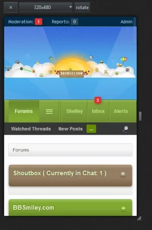
option to remove header (with Logo) and more changes in responsive style

3rd AnGle

Well-known member
I believe it is a waste of space to have header with the logo in a mobile device. Can't we just start from the Nav Bar.. It'd be Very NICE if we can have an option to disable to header in responsive design.

and the other tabs, can we have them open on the left just like most of the apps.. Blackthorn did it very nicely... in his XenForoBook Doesn't this look better and more "Appy" :D
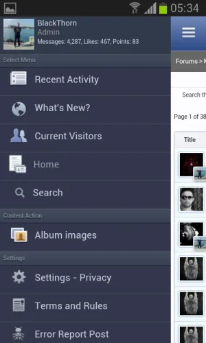
Black thorn.webp
 
That code will completely remove it even on desktop if responsive design is enabled. .Responsive indicates that responsive design is enabled, not that browser width is small.

It will also remove navigation and won't change header height because it has fixed height for logo + navigation.

Use this instead:
Code:
@media (max-width:{xen:property maxResponsiveWideWidth})
{
     .Responsive #logoBlock { display: none; }
     .Responsive #headerMover #headerProxy { height: {xen:calc '@headerTabHeight * 2 + 2'}px; }
}
 
sorry.. but i have gotto ask this foolish question... do i put these lines of code in extra.css? or is it some edit in the original template?
 
That code will completely remove it even on desktop if responsive design is enabled. .Responsive indicates that responsive design is enabled, not that browser width is small.

It will also remove navigation and won't change header height because it has fixed height for logo + navigation.

Use this instead:
Code:
@media (max-width:{xen:property maxResponsiveWideWidth})
{
     .Responsive #logoBlock { display: none; }
     .Responsive #headerMover #headerProxy { height: {xen:calc '@headerTabHeight * 2 + 2'}px; }
}

One problem with this code, when logged in as a normal user the red alerts above the Inbox and Alerts are cut off.
 
Good point. Keep some space above navigation by adding
Code:
.Responsive #navigation { padding-top: 20px; }
and in that xen:calc change +2 to +22
 
I don't mind the logo/header area being there and personally like @CyberAP solution where it contracts depending on responsive width. Though I'll most probably try other methods but so far I'm satisfied with my current solution.

Screenshot_5.webp
 
Back
Top Bottom