Ohio Grillers BBQ and Smoking forum

Rich

Active member
Hi everyone, Im a long time member from when this wonderful software started. I decided that it's time to do this again. We are in times when users are going to get fed up with all the other formats that control you.

Im in the beginning stages and need members so be easy on me.

www.ohiogrillers.com

Things are changing and im looking for input on plugins. In the future I would like a recipes format add-on
Screenshot 2023-01-14 at 6.07.51 PM.webp
 
Last edited:
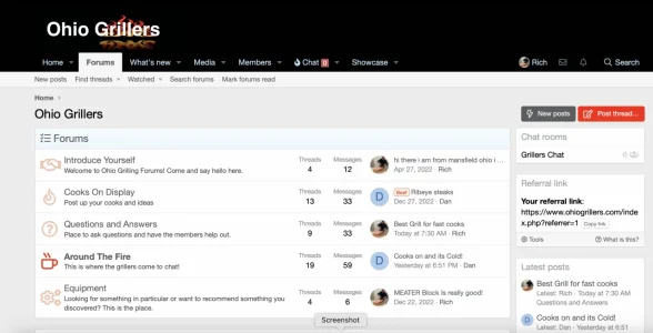
Using the default Ohio Blue style,

I like the shadow behind the logo. Makes it pop. The red on blue is a bit harsh though.

I really like how you made use of the default XF style. It puts the content first. No distracting fancy CSS tricks. Less is more in some cases and I think it fits for your forum.

Speaking of less is more, great job on the layout of the forums. You have one category and a few essential forums in it. Perfect.

The homepage as a whole is done well too. Because of the notice at the top and the video widget at the bottom, the page looks full. The content is about the same height as the sidebar, leaving no big open space at the bottom of the containers.

I like the individual node icons but you should add a custom one for the equipment forum as well.

Remove the spaces before the commas here:
Grills , Smokers , and Cooking

There are some inconsistencies with capitalization throughout. The welcome notice, forum descriptions, and video widget title to name some.
Example: We are glad you found us, -C-ome and join our -F-riendly group. Click here to -J-oin -I-n
 
Looks like a good start l, the red text is hard on the eyes on the logo but eventually you will change the design anyways prob. The forum looks good and the content on the sidebar looks awesome l. Now you just need to go to some grilled meets around Ohio and start building your network.
 
Using the default Ohio Blue style,

I like the shadow behind the logo. Makes it pop. The red on blue is a bit harsh though.

I really like how you made use of the default XF style. It puts the content first. No distracting fancy CSS tricks. Less is more in some cases and I think it fits for your forum.

Speaking of less is more, great job on the layout of the forums. You have one category and a few essential forums in it. Perfect.

The homepage as a whole is done well too. Because of the notice at the top and the video widget at the bottom, the page looks full. The content is about the same height as the sidebar, leaving no big open space at the bottom of the containers.

I like the individual node icons but you should add a custom one for the equipment forum as well.

Remove the spaces before the commas here:
Grills , Smokers , and Cooking

There are some inconsistencies with capitalization throughout. The welcome notice, forum descriptions, and video widget title to name some.
Example: We are glad you found us, -C-ome and join our -F-riendly group. Click here to -J-oin -I-n
Thank you for your input. I will get to working on the capitalizations. I'll repost as I get things fixed.
 
Using the default Ohio Blue style,

I like the shadow behind the logo. Makes it pop. The red on blue is a bit harsh though.

I really like how you made use of the default XF style. It puts the content first. No distracting fancy CSS tricks. Less is more in some cases and I think it fits for your forum.

Speaking of less is more, great job on the layout of the forums. You have one category and a few essential forums in it. Perfect.

The homepage as a whole is done well too. Because of the notice at the top and the video widget at the bottom, the page looks full. The content is about the same height as the sidebar, leaving no big open space at the bottom of the containers.

I like the individual node icons but you should add a custom one for the equipment forum as well.

Remove the spaces before the commas here:
Grills , Smokers , and Cooking

There are some inconsistencies with capitalization throughout. The welcome notice, forum descriptions, and video widget title to name some.
Example: We are glad you found us, -C-ome and join our -F-riendly group. Click here to -J-oin -I-n
Went to a different look. Take a look
 
Top Bottom