Style New Horizons - Dark Style (W.I.P)

Made a few more changes. The footer images on the node li (debating whether to remove the forum spaces) you can see how that looks with them removed and looking at previous screenies. Not sure whether I want them removed or not. :D

It seems the forum_list is taking a different turn from what was originally planned. So anything goes, suggestions, critique be harsh i'm looking to improve and not all designs that i think might look good actually do on the changes i'm doing :P
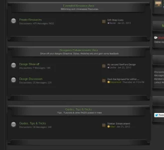
forumlist_latest_new_horizons.webp
 
I think it looks good, a bit too much space now, and I am not digging it without the bottom shadow, just doesn't look right now to me.

I would suggest tightening it up space wise then have a looksie at how it is shaping up :)
 
Shelley, I see what you did there with the admin avatars. That's a feature I am HIGHLY anticipating :)
 
Here's the css I used, but yours will most definitely differ but i don't mind posting it here since I won't provide any support if users have trouble with it so please don't ask. It's merely a placeholder until I implement a better solution. And even then, I'm not even sure i'll keep it in. Some of the css will be redundant and won't even be used as each style as its own settings since it's built around my own style but it's something for you to work off. :)

Code:
.staff .messageUserInfo .userMood img {display: none;}
.staff .messageUserBlock .avatar img,
.staff .messageUserBlock .avatar .img, .staff .avatarCropper {margin-left: 3px; margin-top: 5px!important; margin-bottom: 5px!important;}
.staff .messageUserInfo {width: 130px!important;}
.staff .ribbon1 li { height: 0 !important; padding: 0 !important;}
 
.staff .ribbonAdmin { background: none transparent !important; }
 
.staff .messageUserBlock {
    background: none transparent!important;
    border: 0 solid #D7EDFC !important;
    border-radius: 5px 5px 5px 5px; }
 
.staff .messageUserBlock div.avatarHolder {
    background-color: transparent !important;
    background: url("@imagePath/xenforo/gradients/staff_enhancement.png") no-repeat top center scroll transparent!important;}
 
.staff .messageUserBlock .extraUserInfo {display: none;}
 
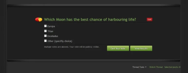
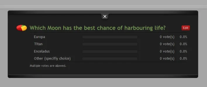
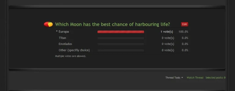
Did a few more enhancements (poll) though there is a design flaw I missed in the top 3 piece images (border showing I'll fix this) and the black border within the polls are a little too dark which will be lightened slightly.

poll1.webp
poll2-view-results.webp
poll3-vited.webp
 
Top Bottom