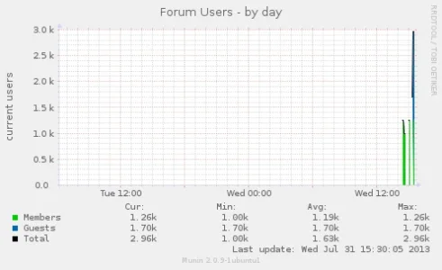
Hmm, it's strange. Let me boot up the PC at home, and I'll create a HTML page with the string we are looking for in there, and try and re-create it.I think this one shows it better that it's definitely when the Members online is over 1000.
View attachment 52730
You are using an out of date browser. It may not display this or other websites correctly.
You should upgrade or use an alternative browser.
You should upgrade or use an alternative browser.
Resource icon
Munin Graph Users / Guests Online 2.2
No permission to download
- Thread starter MattW
- Start date
Think I've cracked it!
So for XF 1.1 replace
with
Code:
matt@Matt-PC:/var/www$ /usr/share/munin/plugins/xenforo_users
members.value 1259
guests.value 1702So for XF 1.1 replace
Code:
               my($members) = $2;
                $members =~ s/,//g;
                my($guests) = $3;
                $guests =~ s/,//g;
                print "members.value $members\n";
                print "guests.value $guests\n";
with
Code:
                @results = ("members.value $2\n","guests.value $3\n");
                for (@results) {
                s/,//;
                }
                print @results;
MattW updated Munin Graph Users / Guests Online with a new update entry:
Big Board Fix 2 and XF 1.2 Update
Read the rest of this update entry...
Big Board Fix 2 and XF 1.2 Update
The attached zip now contains two files, one for XenForo 1.1.X and one for XenForo 1.2.X
Please use the version which suits your board version.
It will now work with large volumes of all users online
Code:matt@Matt-PC:/var/www$ /usr/share/munin/plugins/xenforo_users members.value 1674 guests.value 2594 robots.value 1524
Read the rest of this update entry...
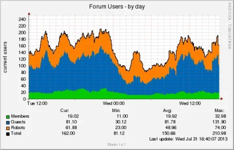
So you want robots to be in their own graph?Grate, maybe you can integrate "robots" separate in next update.
In image I see just members guest and total, but in plugin robots is writed, and from what I know "LWP::UserAgent" is blocked on some webservers, security module or manual by sysadmin. Anyway you plugin is very usefull, I will install it tomorrow.So you want robots to be in their own graph?
The last update has two files. One that works with XF 1.1 and one that will work with XF 1.2In image I see just members guest and total, but in plugin robots is writed, and from what I know "LWP::UserAgent" is blocked on some webservers, security module or manual by sysadmin. Anyway you plugin is very usefull, I will install it tomorrow.
The XF 1.2 will put all 3 entries into the graph.
http://xenforo.com/community/resources/munin-graph-users-guests-online.1382/updates
Last edited:
That seems to work when executing manually:
members.value 1060
guests.value 1568
but the graph still isn't showing the blue line. I'll give it a little while in case it needs it.
Edit: Seems to be showing up now after a few restarts
Cheers
members.value 1060
guests.value 1568
but the graph still isn't showing the blue line. I'll give it a little while in case it needs it.
Edit: Seems to be showing up now after a few restarts
Cheers
Last edited:
It took about 25 minutes for my graph to start showing a build up of the blue line on top of the greenThat seems to work when executing manually:
members.value 1060
guests.value 1568
but the graph still isn't showing the blue line. I'll give it a little while in case it needs it.
Cheers
I installed it but someting is wrong.
In last run i got blank result, I am ussing nginx and disabled all security but still not working.
Edit: FIXED
1st: I forgot about language pack need to modify plugin for you language if you do not use english.
2st: If you use some security modules or rules take of this user-agents "libwww-perl" "libwww" "perl".

For feature update maybe can do something to extract data from databate without to scrape front-end.
Code:
root@xxx:/etc/munin/plugins# ./xenforo_users
members.value U
guests.value U
robots.value U
root@xxx:/etc/munin/plugins# ./xenforo_users autoconf
root@xxx:/etc/munin/plugins#Edit: FIXED
1st: I forgot about language pack need to modify plugin for you language if you do not use english.
2st: If you use some security modules or rules take of this user-agents "libwww-perl" "libwww" "perl".

For feature update maybe can do something to extract data from databate without to scrape front-end.
Last edited:
Can you post a screen shot?While this generally works fine, does everyone elses monthly and yearly plots look ok? The y-axis seems to be incorrect on mine.
Sorry I forgot 
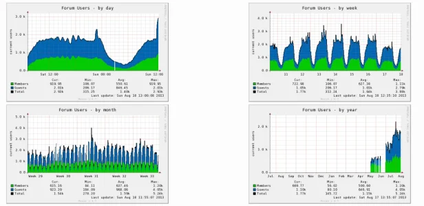
The top row seems ok but the month and year ones on the bottom row seem off.
In the top two graphs the values stack (which is how the rest of Munin seems to work) with the blue being built on top of the green and not underneath it.
In the month plot, the top total number should be just over 5K but it's actually displaying at the "Guests" value of just over 4k.
The year graph seems even worse. The y-axis is only around 2K but the maximum value should be 5k.
I hope that makes sense?
The month and year graphs take an average
http://munin-monitoring.org/ticket/1051
http://munin-monitoring.org/ticket/1051
This is an artifact of the storage format: The RRD file stores min/max/average values for the time periods specified by Munin, but when Munin generates graphs the line is always based on the average values. Since the larger time span views have to compress the data, the larger time spans cause the sharp peaks and valleys in the average values to soften and disappear. Conversely, it's easy to retain the max/min information because you just keep the bigger/smaller value. In this way, the further you zoom out, the more flat the line will get, while the min/max will still tell you how high it actually went.
I've seen other projects that use RRDs show the MAX/MIN values on the graphs, but I'm not sure if Munin has any built-in capability for it. It's tricky because it can easily make the graph crowded and hard to interpret.
Are you sure that's it? It'd be good to see a few other people's graphs if possible.
The monthly one seems to be showing the max values but not placed on top of each other. It's a bit of a coincidence that it's calculated the average numbers to plot to be pretty much the same numbers (4k and 1.2k) as the maximums.
The monthly one seems to be showing the max values but not placed on top of each other. It's a bit of a coincidence that it's calculated the average numbers to plot to be pretty much the same numbers (4k and 1.2k) as the maximums.
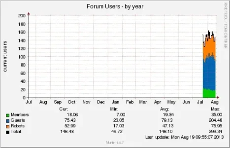
That looks to me like yours is "stacking" correctly but mine isn't. I agree that it's using the average values.
Your green line is around 20 which is similar to your average, you blue line is around 100 (which is 80 for guests plus the 20 for members), your orange line is another 50 on top of that.
It might be that I don't have enough year data yet to tell if it's working for mine though as we fluctuate a lot over the year so our average isn't consistent like yours is.
Have you got a similar monthly plot?
I'll post the monthly one when I get homeThat looks to me like yours is "stacking" correctly but mine isn't. I agree that it's using the average values.
Your green line is around 20 which is similar to your average, you blue line is around 100 (which is 80 for guests plus the 20 for members), your orange line is another 50 on top of that.
It might be that I don't have enough year data yet to tell if it's working for mine though as we fluctuate a lot over the year so our average isn't consistent like yours is.
Have you got a similar monthly plot?
Similar threads
- Question
- Replies
- 1
- Views
- 932
- Question
- Replies
- 2
- Views
- 648
- Replies
- 1
- Views
- 738
