Marvel Vs Capcom 3 Forum

Carlos

Well-known member
The site launched in December. I bought the site a week afterwards.

I love the Marvel Vs Capcom universe, so it would have been a no-brainer for me to buy it.

The site has been on the rise for a month, and the site has been a self-sustaining website for the most part. Which is impressive. Not too many niche gaming websites stands on its own two feet.

I am very impressed with the focus and direct marketing that I have done to the site. Nothing short of amazing.

The main website is www.mvc3forum.com

Its other domains are:

www.mvc3forums.com
www.marvelvscapcom3forum.com
www.marvelvscapcom3forums.com

What's impressive is that the site is on a unproven software, yet the site is more successful than it looks.
 
Ok here I go

Login tab at the top has a shadow but the rest of the bar does not (same as the border), The header image looks sill on bigger monitors as its set to repeat so you end up with a Line and than repeat..

Your sidebar cats have alot of "shine" on them making the text hard to read.
The forum cats are not level in size vs the small "latest" ones

On the threads page the "replies and views" are again hard to read.

The shine on your nav bars kills the "quick nav" images

The Bright blue box on the footer just does not fit imo looks like its from some other site :p
and the box around the footer links also looks abit out of place.

Meh my opinions anyway:)
 
Toning down things can help them play along better with each other. Which is something you should try in your design :) Because you have conflicts everywhere. Saturate colors competing with each other, and bright elements competing with the dark background. It's like a middle of a war. Try change the background-color to 333336 instead of 000003 and see what happens.

A lot of your elements are straight from light styles. Like the icons and the over laying gradients. Those are really hurting your style. You should try download some dark themes where the authors already took care of those elements and experiment from there.
 
I said I'll get around to it, but Capcom just announced Ultimate MvC3 at Comic Con, and I capitalized on it. The site saw its busiest day since the release of MVC3.

In other news... MVC3Forum got featured on xenforo. :) Thanks Kier!

MVC3FFeatured.webp

FYI, the reason why I have a Mega Man avatar in there is because Capcom has been a controversial company at Comic Con by not including Mega Man in MVC3 in the first place, and they STILL didn't do it in UMVC3, on top of that, they canceled two mega man games this year: Mega Man Universe, and Mega Man Legends 3. Obviously, Mega Man fans are angry.

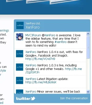
In other news, I edited the sidebar to replace the old ad with Facebook's social box. :)
 
I was aiming for a gamer forum; usually a gamer forum is dark. Most hardcore gamers want 'em. I'll find a grey-ish design though due to your feedback.

I'm a hardcore gamer - does't mean I mean that I want to squint at websites all day. my old gaming community was over a 1000 strong and no dark colours at all. With Marvel vs Capcom look at some of the game covers for colour inspiration - nice strong blues and yellows etc
 
I'm a hardcore gamer - does't mean I mean that I want to squint at websites all day. my old gaming community was over a 1000 strong and no dark colours at all. With Marvel vs Capcom look at some of the game covers for colour inspiration - nice strong blues and yellows etc
Blues - Check
Red - Check [Marvel]
Yellow? Nohpe! Where would I put yellow? Definitely not the body! I don't want to blind your eyes! O_O

And btw, a lot of hardcore gaming websites are usually dark, for example www.mw3forum.com [warning: vB powered!]
 
Blues - Check
Red - Check [Marvel]
Yellow? Nohpe! Where would I put yellow? Definitely not the body! I don't want to blind your eyes! O_O

And btw, a lot of hardcore gaming websites are usually dark, for example www.mw3forum.com [warning: vB powered!]
Yes but their colors blend together, the colors you use don't really blend at all and just seem placed there.
 
Top Bottom