vbuser
Active member
Many of my forum members interact through their phones. My vB forum had mobile apps and tapatalk. These apps were widely used. My members are saying the xenforo forum is "so small!"
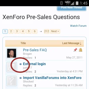
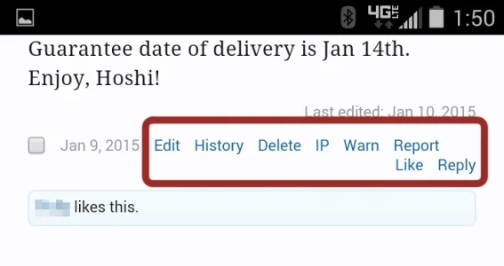
Here's some problems I'd like to point out. In the first example the unread icon is very tiny on a phone. You can accidentally hit other links instead (i.e. OP's name). Here's another example. These user options are clustered too closely and again the wrong link might be clicked.
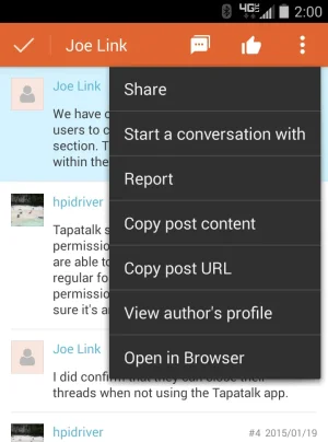
How does tapatalk solve this problem. They move these options into a new menu with easily readible text with large buttons. Some styles in the Resources section utilize this idea (i.e. xForbook Mobile).
I'm not saying xenforo needs apps but we can utilize some of these user-friendly ideas.
Here's some problems I'd like to point out. In the first example the unread icon is very tiny on a phone. You can accidentally hit other links instead (i.e. OP's name). Here's another example. These user options are clustered too closely and again the wrong link might be clicked.


How does tapatalk solve this problem. They move these options into a new menu with easily readible text with large buttons. Some styles in the Resources section utilize this idea (i.e. xForbook Mobile).
I'm not saying xenforo needs apps but we can utilize some of these user-friendly ideas.