XF 2.2 LESS: @media Queries Nested in Class

Digital Jedi

Well-known member
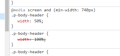
You're supposed to be able to nest @media queries in a class in LESS. Like so:

Less:
.class1 {
  width: 100%;

  @media screen and (min-width: 740px) {
    width: 50%;
  }
}

I haven't been able to get this to work in xF, though. Has anyone else tried this with any luck?
 
Maybe because you used a syntax that is at least 6 years old and if you had used the syntax recommended by W3C (your link) it would work... a bit like what I proposed to you in my first message...
 
Your original CSS works fine. Did you create a custom CSS template by chance? It needs to be a .less template if so. Putting this into extra.less outputs the right CSS though.

Code:
.p-body-header {
  width: 100%;

  @media screen and (min-width: 740px) {
    width: 50%;
  }
}

T8TMtCn.png
 
Yes, it is a .less template in the Default Style. However I did just find out that I forgot to put the call in the Default Style template. With that said, it is in the CONTAINER template of the custom style. So even though I screwed that up, the .less template and the code to call it are in the style I've been testing it on. It just doesn't do anything for me. I'll keep trying.
 
Top Bottom