Joystick Required Forums

Yeah I want backgrounds in the cats. Don't want to make them but I want them? :D I just have to make sure they match everything else. It's tougher with a dark style.

I reduced the navigation panel and breadcrumbs to a much smaller vertical size to bring content closer to the top. Added Font-Awesome icons to the category titles.

I think it'll be easier on dark styles. What I would suggest is default, have the images set at a low opacity and have them at full opacity on hover. I think the most difficult part is finding the appropriate imagery that will both go with your categories and not compromise the readability of the text since same coloured text on the same coloured background is something you are likely to face. So finding the appropriate imagery will be essential imo but there's plenty on the web and I'm sure it won't be as difficult to find as I probably am assuming.

With regards to navigation. Personally, I like and much prefer increase height in the main nav but that is purely my own personal preference. Shorter in height navs just remind me too much of the xenforo default heights which I've never been too fond of but eitherway, still looking excellent.
 
Keep in mind though that the nav is going to be fixed and always there. Hi vertical is ok when it scrolls away but not so much when it's always there. At least that's my thinking.
 
I think it'll be easier on dark styles. What I would suggest is default, have the images set at a low opacity and have them at full opacity on hover. I think the most difficult part is finding the appropriate imagery that will both go with your categories and not compromise the readability of the text since same coloured text on the same coloured background is something you are likely to face. So finding the appropriate imagery will be essential imo but there's plenty on the web and I'm sure it won't be as difficult to find as I probably am assuming.

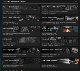
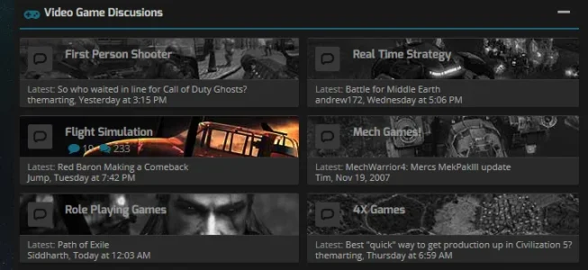
I decided to go with black and white images and have them go to color on hover. Looks pretty good actually. The black and white (darkened) sits with the style better IMO. But like I thought. Coming up with images for more general forums is a tough one. I have a headache from thinking too hard. :D

jsr_current.webp
 
I decided to go with black and white images and have them go to color on hover. Looks pretty good actually. The black and white (darkened) sits with the style better IMO. But like I thought. Coming up with images for more general forums is a tough one. I have a headache from thinking too hard. :D

View attachment 61718

Very good choice. I think that would have been my first choice over the lower opacity. So yeah, that is looking so much better @Code Monkey. A vast improvement. :)
 
Thanks Shelley.

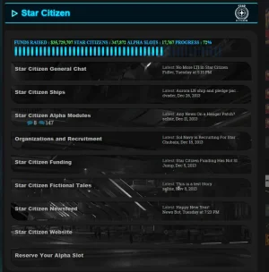
I also went crazy on all my old nodes which were now sub-nodes of sub-nodes. I had about 50 - 60 nodes for three old games that are no longer active. Since they are mainly there for reference and nostalgia of old time members I set a prefix for each games different nodes then moved them all into a single node for each game. They can still sort by prefix like they did with separate nodes but I was able to deleted about 50 nodes which got rid of a lot of that overhead and the tunneling needed to get to that information. I think I'm finally sold on prefixes. :D
 
Done a lot of work on this. Still more to do and so little time.

I did away with node Icons since they seemed redundant with node images already there. Plus I brought the new post indicator style from the posts to the nodes.
forum_home.webp

Got our came categories restyled. I think they look pretty good.

category.webp


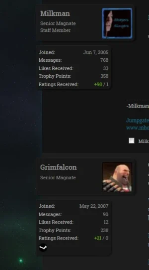
Did some work on the postbit which I like. I liked how quark had and option to float the avatar closer to the message. I didn't like it all alone out there so I built around it. Looks pretty cool.

postbit_changes.webp

Plus font-awesome everywhere.

How do you like it? Any opinions or suggestions? There are still some things I am stuck on graphically but hopefully I will feel inspired before our 10th anniversary.
 
Last edited:
I guess no one liked eh?

Anyway, to counter my terrible year last year the game that was the main focus for our site years ago has been reconstituted on Russian servers for free. So all our old members have come home to roost. Pretty awesome seeing them return as they find out about it. I guess the company that holds rights gave them the server code and is looking the other way since they have no use or intent for it. As long as it's free. So activity is on the rise. :D
 
Thanks Brogan. Yeah Sheldon does do nice work. It's a pretty easy style to work with. I did everything through my new system for loading custom CSS only where it's needed and all style mods are actually a seperate mod that utilizes the Template Manager so hopefully very little maintenance on updates.
 
Only a couple things holding me from implementing this style. One @Sheldon just gave me a fix for which worked great. Two is I don't really want to until I see what very big update coming to a major mod is going to do to my customizations for that. But the biggest thing preventing the release is I am totally blank on the last two images I need for the nodes. Gaming nodes are easy, most nodes are. But the last two nodes I have been staring at for a month without inspiration. Anyone have suggestions? :D

Introductions and Official Site Forums.

image_needs.webp
 
Looks nice! Im actually doing something similar on the same theme! haha..only difference is blurring out the node images and making them unblurred on hover and having the lastpost info have the node background image with a darker background opacity. Well done!

btw you spelt pollute in your notice incorrectly :)


Thanks for letting me know.
 
Did some work on the postbit which I like. I liked how quark had and option to float the avatar closer to the message. I didn't like it all alone out there so I built around it. Looks pretty cool.

View attachment 64015
I like Quark, but I wasn't digging the postbit, it's a bit wierd to me. So, I was like "nah, I don't want to buy this." Then I see your edits... "Hmmm... Cleverly coded. Nice job!"

Feels like a Steam site, too.

Nice job on the forum nodes on Quark! :)
 
Back
Top Bottom