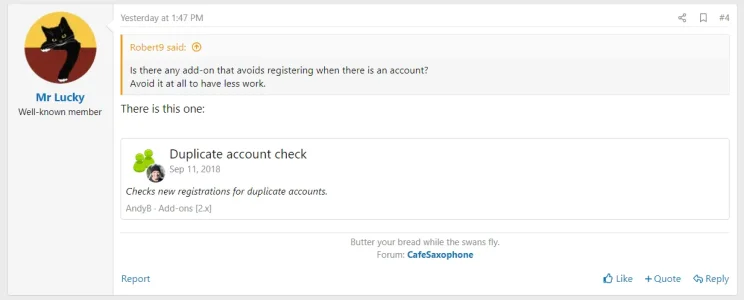
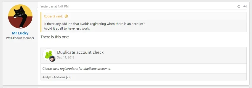
The new embeds are quite cool, but I find it difficult to read them. They seem to lack any kind of visual hierarchy to help the user easily scan them and understand how they're laid out and what's the actual content, what's the header, what's footer etc. It's just a plain white box.
This can be an issue for both large embeds and smaller embeds.
Please consider styling both the header and footer to give some degree of design separation, which will then more easily allow users to scan to and focus on the content of the embed itself.
eg.
Current unstyled:

Example of how it could be styled to add some hierarchy:

This can be an issue for both large embeds and smaller embeds.
Please consider styling both the header and footer to give some degree of design separation, which will then more easily allow users to scan to and focus on the content of the embed itself.
eg.
Current unstyled:

Example of how it could be styled to add some hierarchy:

Upvote
10
