https://watchgtg.com/ - Social Watch forum

Los

New member
Hello all!

So I've been a forum admin for a whopping two weeks or so, and it's been wild just to get it up to where it is now. I still know pretty much nothing, so I'm putting it up here for a trial by fire.

Please rip it to shreds so I can make a list of what I'm doing wrong, and hopefully I can Google my way to some fixes. I know pretty much nothing, and am starting to feel bad for Jake and Mike at Audentio having to troubleshoot my stuff- they're pretty awesome. :) I've also asked for help on a couple of other forums, so hopefully I can get some things fixed before the critique, ha!

https://watchgtg.com/

Thanks in advance for your advice!

Take care,
Carlos
 
Last edited by a moderator:
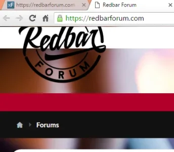
I really like the way your site looks, except for the background image. I just find it's a bit busy for my tastes. I do like the colors used however.

Like the logo, somethings up with it though , gets cut off:
upload_2016-3-24_16-53-39.webp

I assume this isn't intentional since the logo links to this...
upload_2016-3-24_16-55-3.webp
 
Nice theme and I'll also reiterate what @Clever Moniker said about the logo it gets cut off at least on mobile cause that's what I'm on atm. Is that a custom theme from Audentio or you have them customize an existing theme? Either way other than the logo it looks awesome to me.
 
Thanks!

The logo is the biggest outstanding issue I'm working on. I obviously found where to added the logo, but can't figure out why it gets cut off. I've tried to add a padding above the logo, have moved around the navigation and login bars several times, but can't figure it why it does that. it's not just mobile.

It's the stock Rekt theme from Audentio. I haven't done anything that didn't involved changing a number, or checking a checkbox. :) I don't have any coding experience.

Thank you both for the blur suggestion. You're now three who have told me to blur that. Just have a better understanding of the style choice behind it- why should I blur it (and darken it)?

Thanks,
Carlos
It makes your site hard to read and hard to post on. The easier on the eyes the more people post and interact IMHO.
 
After our Cincinnati watch group become part of the official Red Bar group, we were also told the Red Bar group actually had a private forum in the works.

I went ahead and re-branded the forum to Watch GTG, since that is essentially what it is all about. (Get To-Gether in "watch idiot savant" terms)

I still haven't gotten much traffic, so I've been steadily putting out content, and hoping that eventually people stick around. Since the re branding, I've added XenPorta 2 (thanks @Jaxel - the Add On is awesome, and even an idiot like me could install it. :) ) , and have gotten a few compliments on the site.

I'm still taking in all the advice offered. ;)

Thanks,
Carlos
 
Works great for your site and content. Good move !
Thanks!

I guess.
I found the name watchGTG odd.
Yeah, I'm not sure where it came from, but a quick search shows it showing up on forum threads as far back as 2012.
http://forums.watchuseek.com/f325/watch-gtg-some-mkii-content-653851.html

At the bottom of the landing page ... can you add some links to Latest forum threads ? Manually link to some of your most popular threads ?
I'll get on that! :)
XenPorta 2 gives the option to put it pretty much anywhere, so I'll try the bottom, and if not, see how it looks as a sidebar.

Thanks,
Carlos
 
Back
Top Bottom