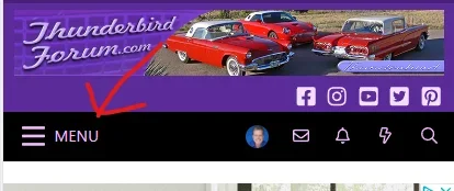
I mentioned this back on 2.2, but I had to adjust the CSS a little for 2.3 so I'm sharing it below. Just add this to your extra.less file. This could possibly be one of the most important UX things you can do for any website. I've been using the internet since 1990, so it's easy to forget that not everyone is a guru. AB tests have shown that there are more clicks on a hamburger icon if it says "menu". Quite frankly, I'm not sure why this is not an option on more themes and software. You would be surprised how many users are still clueless with the hamburger icon is.

Code:
.p-nav-menuTrigger::after {
    content: "menu";
    font-style: normal;
    text-transform: uppercase;
    font-size: 1.1em;
    padding-left: 0px;
    position: relative;
    top: -2px;
}