Oldengine
Active member
Some of my users (with poorer eyesight) are complaining about how bright the screen is and how it hurts their eyes and how they can only look at it for ten minutes at a time. My users consist of many older users including myself. Complaints make me feel really great after installing, making the move and getting the forum running again from vB3.8 and its older default display. The new style is the XenForo default with my logo added in and a banner for our regular suppliers. It works excellently on iPhones and iPads. I had changed the background with a gray smoke graphic which was pretty close to the default background color. Choosing .gif .png or .jpg was made with .jpg being the least amount of file size.
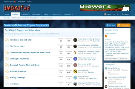
Checking out a darker bluish smoke color background wipes out the black print top title and the other page titles when reading posts or the page titles when going to any of the other top menu choices. I haven't found any other pitfalls to this point. Can anyone point me in the right direction to change the title lettering "Smokstak® Antique Engine Community" from BLACK to WHITE or some shade of white? Mouse highlighted so you can see it.

Checking out a darker bluish smoke color background wipes out the black print top title and the other page titles when reading posts or the page titles when going to any of the other top menu choices. I haven't found any other pitfalls to this point. Can anyone point me in the right direction to change the title lettering "Smokstak® Antique Engine Community" from BLACK to WHITE or some shade of white? Mouse highlighted so you can see it.

Smokstak® Antique Engine Community
Hit and miss engine collecting, restoring vintage engines, antique engine and tractor shows, old generator restoration.
www.smokstak.com
Last edited:
