Horizontal postbit

Bram

Well-known member
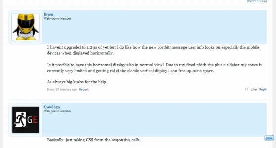
I havent upgraded to 1.2 as of yet but I do like how the new postbit/message user info looks on especially the mobile devices when displayed horizontally.

Is it possible to have this horizontal display also in normal view? Due to my fixed width site plus a sidebar my space is currently very limited and getting rid of the classic vertical display i can free up some space.

As always big kudos for the help.
 
Basically, just taking CSS from the responsive calls

Code:
.messageUserInfo
{
        float: none;
        width: auto;
}

.messageUserBlock
{
        overflow: hidden;
}

.messageUserBlock div.avatarHolder
{
        float: left;
}

.messageUserBlock .arrow
{
        display: none;
}

.messageUserBlock h3.userText
{
        float: left;
}

upload_2013-6-27_10-22-43.webp
 
Basically, just taking CSS from the responsive calls

Code:
.messageUserInfo
{
        float: none;
        width: auto;
}

.messageUserBlock
{
        overflow: hidden;
}

.messageUserBlock div.avatarHolder
{
        float: left;
}

.messageUserBlock .arrow
{
        display: none;
}

.messageUserBlock h3.userText
{
        float: left;
}

View attachment 50032

Nice one I was doing something very similar and turning to responsive for the solution but never submitted since i've modded my message block elements with those pesky banners. Nice work Steve reposnive was the first thing i ran to to look for the horizontal view :P

Just bare in mind the lip on banners in 1.2 may cause some undesirable effects since they aren't hanging/clinging to any edges which I had to add (I'm using images) and damn I'm paying for it :D. Not difficult though just takes a little tinkering @Bram :)

Still tinkering around with it myself.

Untitled-2.webp
 
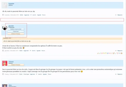
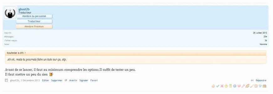
Has somebody figured out how to use the horizontal postbit, that you see on mobile phones when browsing XF, in desktop mode? Think it will look rather good actually especially with the mini avatar instead of the huge block on the left that isnt very suited for my style imo.
 
I think i figured it out. Try adding this to extra.css

.messageUserInfo {
float: none !important;
width: auto !important;
}

.messageUserBlock div.avatarHolder .avatar img {
width: 48px;
height: 48px;
}

.Responsive .messageUserBlock div.avatarHolder
{
float: left;
padding: 5px;
}

.messageUserBlock h3.userText {
margin-left: 64px;
}

.messageUserBlock {
overflow: hidden;
margin-bottom: 5px;
position: relative;
}

.messageUserBlock .userBanner
{
max-width: 150px;
margin-left: 0;
margin-right: 0;
border-top-left-radius: 3px;
border-top-right-radius: 3px;
position: static;
display: inline-block;
}

.messageUserBlock a.username {
padding-top: 2px;
}

Plus!

Go to Style Properties > Message Layout, and remove the left padding from Content Container. Change the css in main content to min-height: 30px; or something that fits your needs :)
 
Last edited:
I think i figured it out. Try adding this to extra.css

.messageUserInfo {
float: none !important;
width: auto !important;
}

.messageUserBlock div.avatarHolder .avatar img {
width: 48px;
height: 48px;
}

.Responsive .messageUserBlock div.avatarHolder
{
float: left;
padding: 5px;
}

.messageUserBlock h3.userText {
margin-left: 64px;
}

.messageUserBlock {
overflow: hidden;
margin-bottom: 5px;
position: relative;
}

.messageUserBlock .userBanner
{
max-width: 150px;
margin-left: 0;
margin-right: 0;
border-top-left-radius: 3px;
border-top-right-radius: 3px;
position: static;
display: inline-block;
}

.messageUserBlock a.username {
padding-top: 2px;
}

Plus!

Go to Style Properties > Message Layout, and remove the left padding from Content Container. Change the css in main content to min-height: 30px; or something that fits your needs :)
Work !

PS: no need changes, just add this in extra.css:

Code:
.message .messageInfo {
@property "messageInfo";
margin-left: 0px;
@property "/messageInfo";
}
.message .messageContent {
@property "messageContent";
min-height: 30px;
@property "/messageContent";
}

There are still some problems :p

Screenshot_16.webp
 
Top Bottom