XF 2.0 Hide logo on Mobile Device

MegaPixel

Active member
Hello,

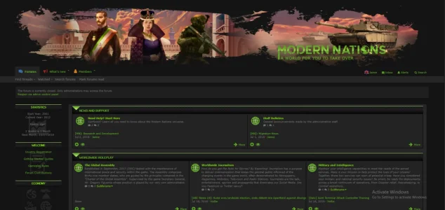
We are working on an update for my forum, and it now has two customized graphics at the top of the board as a 'banner' and 'forum text'.
  • The banner is located in the standard Logo URL (Style Properties > Basic Options)
  • We have put the Forum Text image under the p-header in the PAGE_CONTAINER.
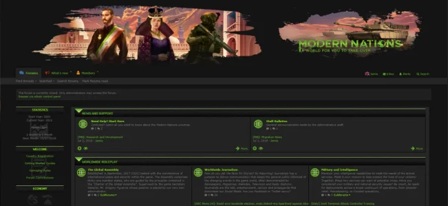
So two separate locations, for our banners. However, what we'd like is to hide the banner (the standard logo url) from mobile devices, so it only shows the forum text from page container on these devices but I'm not sure how. Please could you advise how we can do that?

189272
 
So you want to show just the forum text image logo above the navigation menu on mobile, and hide both the small nav logo and banner on the left on mobile?
 
what is name of style you use on your forum?
It's custom made, just named after the forum "Modern Nations".

So you want to show just the forum text image logo above the navigation menu on mobile, and hide both the small nav logo and banner on the left on mobile?
Yes, that's the case.
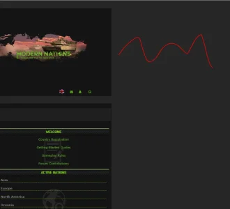
From my image, the left banner (the XF Logo) should be hidden on mobile devices.
The right logo/image should show on mobile devices instead.
 
It's custom made, just named after the forum "Modern Nations".


Yes, that's the case.
From my image, the left banner (the XF Logo) should be hidden on mobile devices.
The right logo/image should show on mobile devices instead.

Ok mate, can you please send the custom code to the right logo please?
I looked at your forum and you only have a background image. Im guessing the style you're working on is hidden?
 
I got to go on holidays later, so i'll throw some code to mess with mate. Hope this helps.
If you added a image to PAGE_CONTAINER example class: logo-main
Code:
        <div class="logo-main">
                <a href="https://site.com/">
                    <img src="/styles/modernnations/logo.png"
                        alt="Modern Nations" />
                </a>
            </div>

You would use something like this in your extra.less
Code:
@media (max-width: 650px) {
    .p-nav-smallLogo img {
        display: none;
    }
    .p-header-inner {
        padding: 0px;
    }
    .p-header {
        display: block!important;        
    }
}

@media (max-width: 900px) {
    .p-header .p-header-logo--image
{
display: none !important;
}
}

.logo-main {
     display: block!important;
}

Change .logo-main to your custom image class from PAGE_CONTAINER.
Also, you would want your left logo to vanish at a certain width, resize your browser window until your image logos almost hit together, get the px of that width and change 900px with-in the code to your px width. Hope this makes sense.
 
Please could you advise how we can do that?
I think this will do exactly what you're looking for... 😊
 
Hello,

Thank you for the assistance, I will test the above shortly to see how that goes! :) (Current stranded in work!)

We've been considering our banner and we do have an alternative, ideally we'd like to be able to review both banners. The setup you've assisted with above and the second banner we have is one big image that links them. We're trying to figure out what looks best and could work best.

189357
But, if this (again on mobile devices) or a shrinked browser, it adds a huge space to the right of the forum, examples below:

189358

189359

Is this something that can be resolved with something using the @Media in extra.css? Not too familiar with my options to resolve it for this banner. The code for this banner is the below, which was recommended by the person who made our style:

Code:
.p-header-logo.p-header-logo--image img {
    max-width: 250% !important;
    max-height: 300px !important;
}

.p-header-content {
    height: 275px !important;
}

 .p-header {
    margin-right: 70px;
    margin-top: 10px;
}


(Oh, and yes, it's a hidden style on our Development Site ^^)
 
I wonder how you would go using your full 1 image shown in spoiler on desktop. And as the page resizes, your big long logo does to, but at a certain size, your big logo disappears and another small logo appears for ipad and mobile?

And yes, @media will be the way togo mate.

If you would like to send (PM) both big logo and small logo, i could add to test site and give it a crack.
 
Mess around with this code for the full image mate.
Code:
.logo-main {
     display: block!important;
}
.p-header-logo.p-header-logo--image img {
height: auto;
margin-top: -2px;
margin-bottom: -2px;
}
@media (max-width: 650px) {
    .p-nav-smallLogo img {
        display: none;
    }
    .p-header-inner {
        padding: 0px;
    }
    .p-header {
        display: block!important;         
    }
}
@media (max-width: 650px) {
.p-header-logo {
    margin-left: auto !important;
    max-height: 100%;
    max-width: 100%;
    margin-top: -2px;
    margin-bottom: -2px;
}
}
 
Back
Top Bottom