So I am trying to Customize notices.
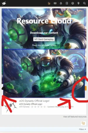
I got responsive Flexbox to work, but when I look at it on mobile, the contents do not stay within the boundaries of the notice box.
When you look at the image, it is covering things.

extra.less
The class I am currently using is the .two-column In my Html, to display 2 divs
Here is the HTML
So I do not know how to get the 2 boxes to stay inside the notice boundaries.

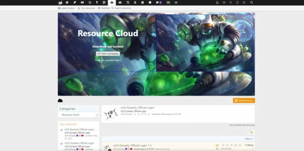
This is the desktop view.
I got responsive Flexbox to work, but when I look at it on mobile, the contents do not stay within the boundaries of the notice box.
When you look at the image, it is covering things.

extra.less
Code:
/* ONE COLUMN */
.one-column {
    text-align: center;
}


/* TWO COLUMN FLEXBOX */
.two-column {
    display: flex;
    flex-direction: row;
}

.two-column div {
    border: 1px solid blue;
    flex: 1;
    display: flex;
    justify-content: center;
    align-items: center;
    text-align: center;
    color: white;
}

.two-column.reverse {
    flex-direction: row-reverse;
}

@media only screen and (max-width: 600px) {
    .two-column,
    .two-column.reverse {
        flex-direction: column;
    }
}


/* THREE COLUMN */
.three-column {
    display: flex;
    align-items: stretch;
}

.three-column div {
    flex: 1;
    border: 1px solid;
    display: flex;
    flex-direction: column-reverse;
    justify-content: flex-end;
    text-align: center;
}

@media only screen and (max-width: 600px) {
    .three-column,
    .three-column div {
        flex-direction: column;
    }
}


span.b {
  display: inline-block;
  width: 100px;
  height: 100px;
  padding: 5px;
  border: 1px solid blue;
  background-color: yellow;
}
The class I am currently using is the .two-column In my Html, to display 2 divs
Here is the HTML
Code:
<!DOCTYPE html>
<html lang="en">

<head>
    <meta charset="UTF-8">
    <meta name="viewport" content="width=device-width, initial-scale=1.0">
    <title>Flexbox Mobile First Multi Column Layout - SoftAuthor</title>

</head>

<body>

    <!-- TWO COLUMN -->
    <section class="two-column">
        <div>
            <span>
    <h1 style="font-size:50px">Resource Cloud</h1>
    <h3>Download our content</h3>
         <form action="https://youtu.be/0FbhbeDcqlk" method="get" target="_blank">
         <button type="submit">MY Bard Gameplay</button>
      </form>
      <p>Peep my youtube video</p>
            </span>
        </div>

        <div>
            <img src="styles/XenSoluce/UserMoodsManager/Bard-Astro-1024x604.jpg" alt="">
        </div>
    </section>


</body>

</html>
So I do not know how to get the 2 boxes to stay inside the notice boundaries.

This is the desktop view.