GamerMob.com - Community

GamerMob

Active member
GamerMob - Community
P0kYsuE.webp

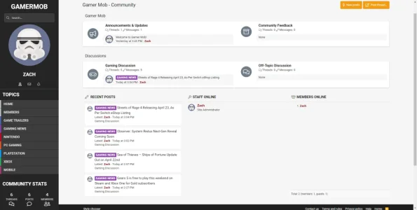
About: Gamer Mob is an internet video game forum to discuss the latest in gaming. Home to PC, Xbox, PlayStation, Nintendo and Mobile gaming.

I still have some work/features I would like to add, but those will come later on. I eventually want to add a homepage that pulls threads from the Gaming News prefix I have created. Still a lot more in the work! Let me know what you think!​
 
Looks good, loving the sidebar navigation. Nice to see something a little different looking :)

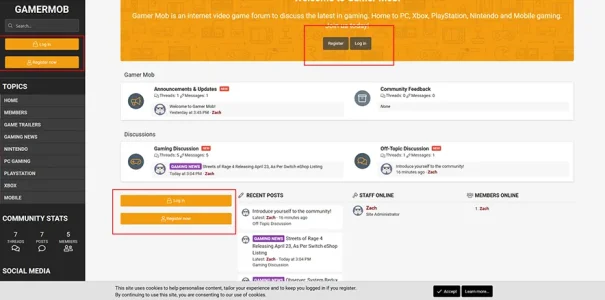
This is maybe just me being pernickety but I'd maybe look at reducing the number of login/register now references

Untitled-1.webp
 
Last edited:
This is one of the best looking forums I've seen on here for a while, excellent work. I love the look of this. Well done.

What PE style did you start with to mod it? Looks good so far!

I'd also be interested to know which style you used as a base, I'm guessing it's UIX?

Thanks and happy easter
 
What PE style did you start with to mod it? Looks good so far!
This is one of the best looking forums I've seen on here for a while, excellent work. I love the look of this. Well done.


I'd also be interested to know which style you used as a base, I'm guessing it's UIX?

Thanks and happy easter

Thanks! It is XenBase from PixelExit thanks to @Russ he did an awesome job with customizing it!
 
Do you mind me asking how much approximately the custom work cost? Thanks
Each custom work is a little different. He had a specific vision in mind so we took my hourly approach to things. If you want to reach out with any idea you have we can discuss a general price.

For what it's worth, all of our styles have a canvas mode enabled which you can view on our demo board. GamerMob had some cool ideas to do custom work on that canvas mode though :)
 
I really love that sidebar and the design of the forum overall.

That said, I do have a suggestion:

1587496962506.webp

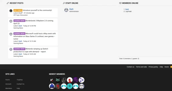
See all the empty space under the staff and members online blocks, due to the recent posts block being longer? I don't think that looks good. I would have recent posts display horizontally across the page, and then down. Basically a table with 3 rows and 2 columns (so it would show 6 recent posts -- add or remove a row as needed).

Then have the staff and members above or below it and they would only be as big as they need to be. More members online? It would grow with the usernames.

The other thing is where the newest members block is located. Being in the footer, it seems inconsistent with the other stats blocks I just mentioned. I would move it up, which would give you 3 columns of stats, which makes sense because you have 3 columns now anyway.
 
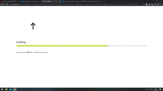
FYI, I think you have a bad advert. I've visited your site a couple times today and kept getting redirected to doctopdftech dot com.
 
I have recently signed up and looks like a lovely site hopefully it will pick up some activity

Great job @Russ

Thank you, I hope so too!

I really love that sidebar and the design of the forum overall.

That said, I do have a suggestion:

View attachment 223064

See all the empty space under the staff and members online blocks, due to the recent posts block being longer? I don't think that looks good. I would have recent posts display horizontally across the page, and then down. Basically a table with 3 rows and 2 columns (so it would show 6 recent posts -- add or remove a row as needed).

Then have the staff and members above or below it and they would only be as big as they need to be. More members online? It would grow with the usernames.

The other thing is where the newest members block is located. Being in the footer, it seems inconsistent with the other stats blocks I just mentioned. I would move it up, which would give you 3 columns of stats, which makes sense because you have 3 columns now anyway.

Thank you for your suggestion. I was thinking the same thing, but just wasn't sure how to approach it. Instead I went ahead and removed the Staff Online block and in its place, I have an icon next to Admin/Mods in the Members Online block.
 
Thank you, I hope so too!


Thank you for your suggestion. I was thinking the same thing, but just wasn't sure how to approach it. Instead I went ahead and removed the Staff Online block and in its place, I have an icon next to Admin/Mods in the Members Online block.
That does look better. If you want to try to get it as I said it, @Russ should be able to easily help you with that.

What are your plans for growing a new gaming forum? It can be harder than most other niches.
 
Top Bottom