XF 2.1 Forum icon rework

Joe Kuhn

Well-known member
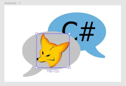
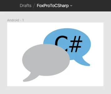
I'm in Figma and I've got this worked out to replace the standard Forum icons
1583211008169.png

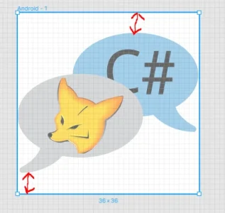
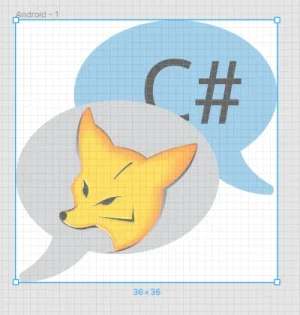
I got the balloon CSV from https://iconify.design/icon-sets/?query=bubbles. The trick was, when I pasted the bubbles into my Frame, they didn't appear at all. Turns out the Width and Height were set to zeros. Made them both 300 so I could see the bubbles and move them around. Then I added a bit of the default font for C#, Tahoma, in a text object and slid it over to the back bubble.

Next I need to get this FoxPro png into that first bubble:
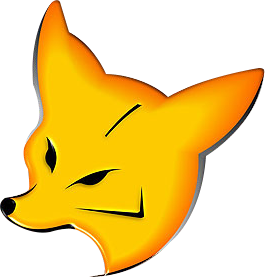

Tried converting the png to CSV and got a black and white version with some other garbage.

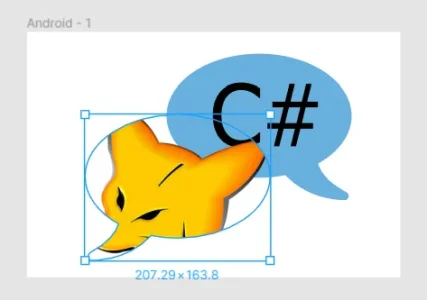
Next I tried, in Figma, to do a File/PlaceImage referencing the png file via the url. The image filled the box containing the first bubble rather than filling the bubble. I could not find a way to shrink the Fox image.
1583212904652.png

Thoughts?
 
Last edited:
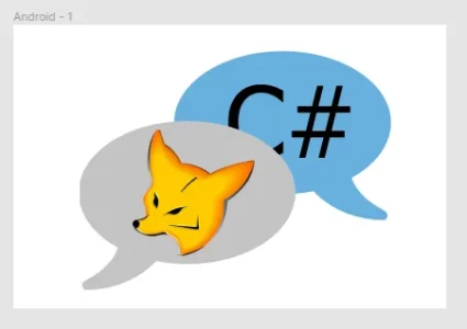
Got it. Had to put a rectangle in the upper left after sizing it to fit in that front bubble, then File/PlaceImage, refer to the url of the fox (makes your mouse pointer = the image) and then drag the fox over to the rectangle and click to drop it in. Drag the rectangle over to the bubble and done.

To give credit where it's due, @Andy gave me some help on a similar project a couple of years ago and I've been referring to his instructions quite a bit.

1583279172499.png

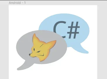
Next I'll need two of these, one for when there's something to read in a Forum and one for when there isn't. I'll try lightening up the color of the fox and the blue in the C# bubble for when there's nothing to read.
 
Last edited:
Finished per Arty's directions and the old icons are gone, but new ones aren't showing. Missed a step at the very beginning in Figma:

Resize artboard to match XenForo node icon size of 36.

Start over.
 
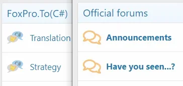
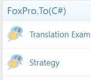
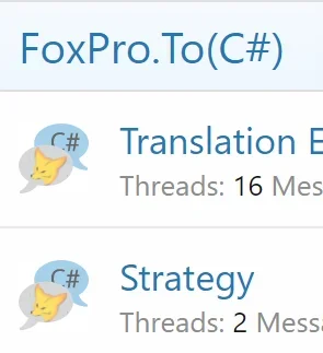
Did them over again, but also discovered the file upload didn't work. Did that again and the new icons are in place. They look too small and fuzzy.

1583384744221.png

Hm.
 
Set both browser panes to 100% and put them side by side.

1583385951713.png

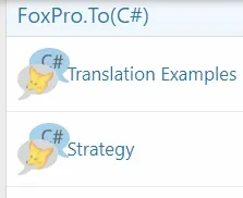
I see why the default icons are so simple, and perhaps why there is no option to change from the defaults. Clarity is not that easy. Although, my icons do look smaller than the xf community icons. Perhaps my node icon size can be a little bigger. Arty did say the limit is 36. Or maybe I've got too much space above and below my bubbles:

1583386391894.png

Task for another day.
 
Better but still too small at 100%.

1583463692172.png

Starts to look good at 150% and can start to see the cheek on the Fox at 200%.

1583463805702.png

And looks darn good at 300%:

1583463940149.png
 
Last edited:
Upped the font size in that section of the code from 32px to 48 and it looks pretty good. Tried 64, but it was too much. This was in the node_list.less template. Need to figure out how to move the margin for the node titles over a little to the right.

1583470443234.png

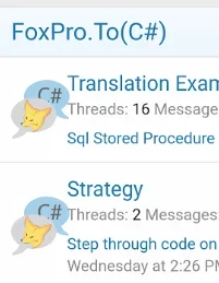
It's pretty good on my phone (below) as well except for that left text margin again. Now where would that be set?

1583471010416.png

If I'm going to go with 48 px, I'll redo the icons for that size to enrich the color.
 
Last edited:
Another idea. Reverse the colors so the blue is behind the yellow fox for contrast. The black "C#" letters should still work on the grey.
 
Last edited:
What have you got between them? An arrow? That's doable. Will try, thanks.
To save horizontal space, you can have the arrow below the fox's head pointing down to the C symbol. Just an idea. It is your project and you need to be happy with it first and foremost :)
 
I like that idea. Will see what i can do with it. Thank you.
Here is a rough idea. I'm sure there are better ways to implement it. Calling all creative ppl to this thread!

mG7Dy7k.png
 
Top Bottom