• This forum has been archived. New threads and replies may not be made. All add-ons/resources that are active should be migrated to the Resource Manager. See this thread for more information.

Erudite - Light and Lovely new skin in development

Kim

Well-known member
Something I have been working on lately, a new light Premium theme called Erudite. This theme is very light, warm creams/washed grays and a slight green tinge.

Here is a sneak peek of the skin in development!

The style is currently still in being constructed, however it shouldn't be too much longer before it is done. Although it is quite customised, the theme uses both CSS and (mostly) light weight images, and is quick loading and pleasant to use.

This one won't utilize the framework that Forsaken and I are currently working on, however it is our plan to be able to "retro-fit" the framework to this theme down the line when it is done. I have to thank Forsaken for the cool drop down menu design!

I hope you enjoy having a look at this theme, and if you have any constructive criticism or feedback, I would love to hear it.
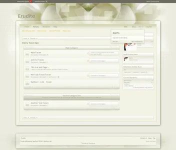
2erudite_index.webp
 
Very nice, i especially love the background. Also original choice of colors (eheh, now i like it :P). Great work Kim. ;-)
 
  • Like
Reactions: Kim
I absolutely LOVE it! This skin is gorgeous.
The one and only thing that I'm not crazy about is the box in the footer with the links and credits in it. Just a simple footer would suffice very well, imo.
But the rest of it........ very very well done.
 
I absolutely LOVE it! This skin is gorgeous.
The one and only thing that I'm not crazy about is the box in the footer with the links and credits in it. Just a simple footer would suffice very well, imo.
But the rest of it........ very very well done.

100% agree, I think there's too much emphasis on the footer, I understand the footer here stands out due to the purchase link but I think it's wasted space at the bottom.

But stunning design, I LOVE that header :)
 
  • Like
Reactions: Kim
Thanks for the feedback everyone :)

That's a beautiful one. I think you could go darker on some lines, it feels just a bit washed out right now.

Hey Panupat, yes I do tend to agree, funnily enough I have redone those category header and footer graphics 6 times! I have had them a lot darker, a little darker, and lighter trying to get the right balance of keeping the style very light, and interesting... I think I will ship the style with two variations, that way people can decide themselves which they prefer.

Also original choice of colors (eheh, now i like it :p). Great work Kim. ;-)

LOL so no "strange colours" this time hey :p hahaha

I absolutely LOVE it! This skin is gorgeous.
The one and only thing that I'm not crazy about is the box in the footer with the links and credits in it. Just a simple footer would suffice very well, imo.
But the rest of it........ very very well done.

100% agree, I think there's too much emphasis on the footer, I understand the footer here stands out due to the purchase link but I think it's wasted space at the bottom.

But stunning design, I LOVE that header :)

Thanks Peggy and Russ, I might try a more simplified footer area.

Thanks again for the feedback and your comments :)
 
I like the design of the footer, it separates the forums and the footer. Gives it a different look.
 
  • Like
Reactions: Kim
A very constant and well thought out skin, Awesome.
The only thing that I would change is move the Style by Xenique up one line but still keep it centered.
 
  • Like
Reactions: Kim
Thanks everyone :)

I have decided to hold this one off until the Framework that Forsaken and I are working on is done and it will have all the cool bits on it as well :D
 
Top Bottom