
You are using an out of date browser. It may not display this or other websites correctly.
You should upgrade or use an alternative browser.
You should upgrade or use an alternative browser.
End Effect ~ Proudly Powered By Xenforo
- Thread starter Wing
- Start date

It looks pretty good but to be honest it feels a bit bulky and hard to navigate.
Thanks for your feedback, could you care to elaborate a bit for us on how we could improve on it?

Thanks for your feedback, could you care to elaborate a bit for us on how we could improve on it?
It's kind of hard to pin point. The site still looks great, just feels a bit bulky. It would probably feel cleaner if the sticky header bar were changed to static. Just my $0.02.

Visually stunning header. 
Sidebar seems quite wide, which is probably fine as I notice you've done this to ensure your Server information is clearly shown.
My only critique is you have three sign up/login buttons, which looks cluttered:
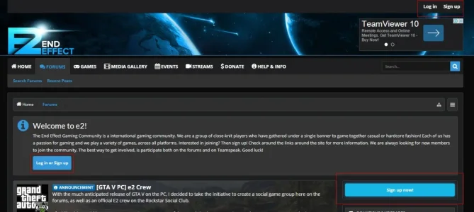
I think you should be able to cut this down to one set - would make it look cleaner and more streamlined.
Sidebar seems quite wide, which is probably fine as I notice you've done this to ensure your Server information is clearly shown.
My only critique is you have three sign up/login buttons, which looks cluttered:
I think you should be able to cut this down to one set - would make it look cleaner and more streamlined.
It's kind of hard to pin point. The site still looks great, just feels a bit bulky. It would probably feel cleaner if the sticky header bar were changed to static. Just my $0.02.
We had a request from our members to enable StickyNav. Also, since a lot of sites seem to be going that way as well, we thought it would be best to follow along as StickyNav seems to be the future

Visually stunning header.
Sidebar seems quite wide, which is probably fine as I notice you've done this to ensure your Server information is clearly shown.
My only critique is you have three sign up/login buttons, which looks cluttered:
View attachment 107175
I think you should be able to cut this down to one set - would make it look cleaner and more streamlined.
Thanks for your feedback. You are right, we have a wide sidebar to ensure that information like the Server Information is clearly shown. I have taken the signup button out of the welcome block to help cut down the clutter. I will investigate further on if we should keep the signup link in the header or remove it and tweak the Visitor Tabs accordingly