Hey all! I was going to put this into the regular forums, because I think I'd have a better chance of a response there -- but I think that's frowned upon... so hopefully someone may find me here in the out fields. Gonna tag @ThemeHouse @Lukas W. and @Dad. -- sorry -- I just know that you're people who may be able to point me in the right direction, if still checking out the forums... 
I am running the ACE theme with Feeds on XF 2.2 -- getting some look and feel challenges down before we move over to XF 2.3 and the updated ACE theme.
While most everything looks rather good (in my very, very humble opinion) there's two challenges with placement that I am hoping is nothing but a simple template fix, somewhere. So here goes:
I've pushed our navigation menu to a hamburger, because it is much cleaner looking but this is how it looks:

And I don't know if that looks "OK" to anyone else? To me the hamburger being so far removed to the left just seems odd (I am open to people telling me I'm being ridiculous) -- so I tried changing the style properties for header/nav to "Right align navigation" and it pushes all the content to the far left of the screen which seems even more off. I was hoping there would be a way to move the hambuger closer to the right so it's proper right aligned before the avatar -- any thoughts?
My biggest concern however, is with AUDFEEDS -- we share a good deal of widgets before you get to our 'feeds' display -- unfortunately the feeds filter and the +Create post button stay at the top of the page, above the widgets and such, rather than appear directly above the actual feeds as shown before:

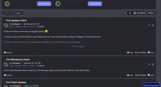
^^ This shows, which is part of FEEDS ^^ above our widget content, rather than above the actual feeds where it would make more sense AFTER our widgets display:

More than my OCD/ADHD with the navigation alignment -- finding a way to pull that activity filter and create button to appear above the actual feeds would be a happy moment.
Sorry to be a pain -- any insight is really appreciated! We're a bit tight on funds, but I'd even be willing to pay a reasonable fee to have someone move that filter and create button down to appear above feeds - as well - if possible.
Thanks all!
Jason
I am running the ACE theme with Feeds on XF 2.2 -- getting some look and feel challenges down before we move over to XF 2.3 and the updated ACE theme.
While most everything looks rather good (in my very, very humble opinion) there's two challenges with placement that I am hoping is nothing but a simple template fix, somewhere. So here goes:
I've pushed our navigation menu to a hamburger, because it is much cleaner looking but this is how it looks:

And I don't know if that looks "OK" to anyone else? To me the hamburger being so far removed to the left just seems odd (I am open to people telling me I'm being ridiculous) -- so I tried changing the style properties for header/nav to "Right align navigation" and it pushes all the content to the far left of the screen which seems even more off. I was hoping there would be a way to move the hambuger closer to the right so it's proper right aligned before the avatar -- any thoughts?
My biggest concern however, is with AUDFEEDS -- we share a good deal of widgets before you get to our 'feeds' display -- unfortunately the feeds filter and the +Create post button stay at the top of the page, above the widgets and such, rather than appear directly above the actual feeds as shown before:

^^ This shows, which is part of FEEDS ^^ above our widget content, rather than above the actual feeds where it would make more sense AFTER our widgets display:

More than my OCD/ADHD with the navigation alignment -- finding a way to pull that activity filter and create button to appear above the actual feeds would be a happy moment.
Sorry to be a pain -- any insight is really appreciated! We're a bit tight on funds, but I'd even be willing to pay a reasonable fee to have someone move that filter and create button down to appear above feeds - as well - if possible.
Thanks all!
Jason
