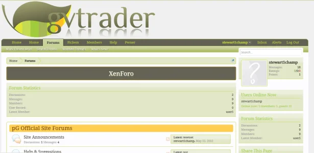
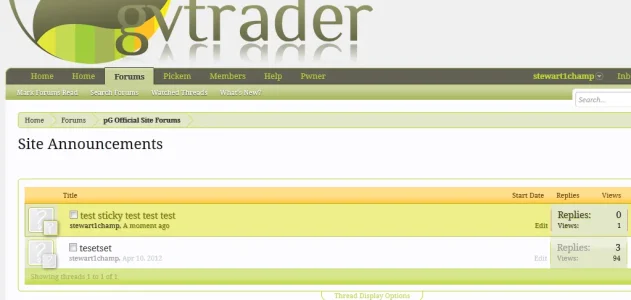
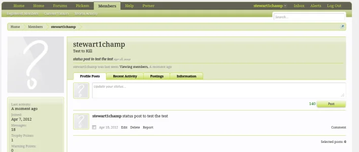
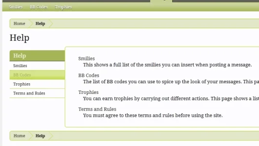
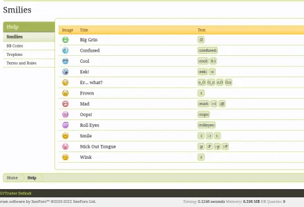
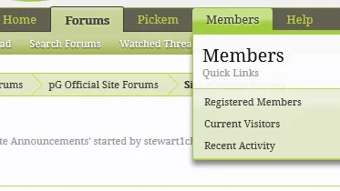
Far from a designer. Not very good on color coordination either... haha. Anywho, could I have your opinions please?
You are using an out of date browser. It may not display this or other websites correctly.
You should upgrade or use an alternative browser.
You should upgrade or use an alternative browser.
Do these colors work with this logo?
- Thread starter Sheldon
- Start date
It looks good to me, I can't really see much room for improvement.
Incidentally, I find this site quite useful sometimes if I'm having issues finding suitable contrasting colours: http://colorschemedesigner.com/
Incidentally, I find this site quite useful sometimes if I'm having issues finding suitable contrasting colours: http://colorschemedesigner.com/
The logo is quite big, if you think there's too much space to the right of it a banner can be placed or something else. Apart from the size the logo and colors seem to be working. I'm not a big fan of that mirror effect. Maybe try to add some extra unique design elements to make it look more interesting. It's not bad so far. 
The logo is quite big, if you think there's too much space to the right of it a banner can be placed or something else. Apart from the size the logo and colors seem to be working. I'm not a big fan of that mirror effect. Maybe try to add some extra unique design elements to make it look more interesting. It's not bad so far.
That is the logo I was told to go off of. No control over it.
jack lance
New member
No issue yet, colors looks eye candy 
Ok I guess I have different tastes than the rest of the people posting; imo there is waaay too much green going on in your theme. If I am to spend a large amount of time on a forum the layout should not get in my way and I feel the amount of green would just be offensive to my eyes. That said I also think you have a very vibrant green in there (particularly in the postbit) which just seems a bit off to me.
I have nothing against the colors you chose per se, I just think you should use them in moderation and tone them down by a -lot- in content heavy areas.
Also, try to mix it up a bit? You seem to be pretty much only using variations of green. Why not add some grey and brown in there? XenForo uses blue as it's main color but any content heavy area is either white or grey and they mix it up with a bit of yellow here and there.
I actually went across the xenforo color palette and changed each according to the colors they had. The darkest blues turned into the grey, the lighter blues turned into green.
Appreciate all the suggestions so far.
You used much darker colors compared to XenForo though. Take a look at your breadcrumbs bar for example. Or the background color for the top part of the profile screen.
