Hi Guys
Our site is almost live but would really, really appriciate some quality feedback on design and usability..
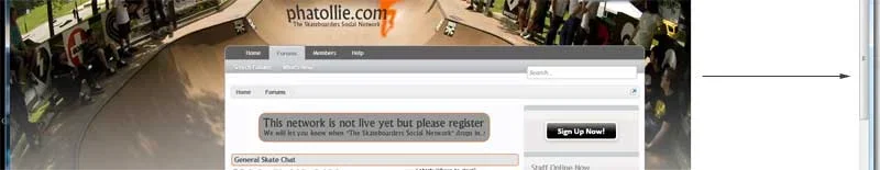
http://www.phatollie.com/
P.S. if any of you are into skateboarding please register, your support is needed and very welcome..
Thanks in advance guys and girls..
Our site is almost live but would really, really appriciate some quality feedback on design and usability..
http://www.phatollie.com/
P.S. if any of you are into skateboarding please register, your support is needed and very welcome..
Thanks in advance guys and girls..

")