Hi,
There are two things I'd like to fix on my site, one is for mobile and the other is for both mobile and desktop.
1. When viewing my site on mobile my header logo re-scales in width, but not in height. At least this is what I think is happening. An easy was to see this in action is to visit my site, http://forgehaven.com/forums/, then resize the window to be that of a mobile device. You'll see that the height never changes. Is there something I can modify for this to scale down in both width and height?
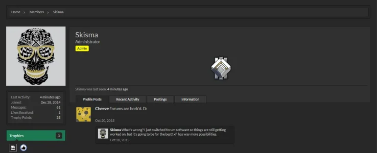
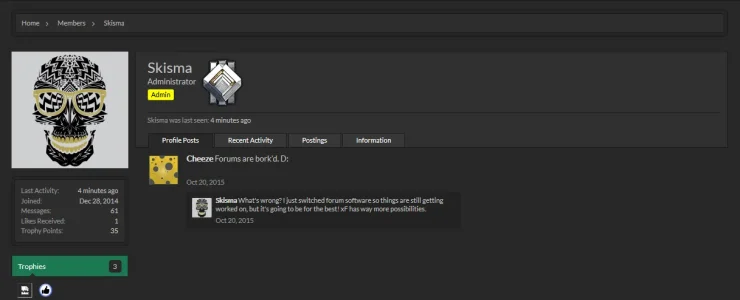
2. I have rank icons setup on my site that are simply user groups with cusom css instead of a banner. Since these are acting as a custom banner, they display in the post-bit area and a users profile page. They look great in the post-bit, but create a completely new row on profile pages. Here's the link to see that: http://forgehaven.com/members/skisma.1/
Ideally, I would like them to remain the same as they are in the post-bit area, but display directly to the right of the username/user title/banners. I've attached screenshots of what it currently looks like, as well as a concept of what I want that I whipped up in ms paint.
Here's the code I'm currently using that is in EXTRA.css
There are two things I'd like to fix on my site, one is for mobile and the other is for both mobile and desktop.
1. When viewing my site on mobile my header logo re-scales in width, but not in height. At least this is what I think is happening. An easy was to see this in action is to visit my site, http://forgehaven.com/forums/, then resize the window to be that of a mobile device. You'll see that the height never changes. Is there something I can modify for this to scale down in both width and height?
2. I have rank icons setup on my site that are simply user groups with cusom css instead of a banner. Since these are acting as a custom banner, they display in the post-bit area and a users profile page. They look great in the post-bit, but create a completely new row on profile pages. Here's the link to see that: http://forgehaven.com/members/skisma.1/
Ideally, I would like them to remain the same as they are in the post-bit area, but display directly to the right of the username/user title/banners. I've attached screenshots of what it currently looks like, as well as a concept of what I want that I whipped up in ms paint.
Here's the code I'm currently using that is in EXTRA.css
Code:
.silverGrade3 {
background: url("http://forgehaven.com/FHimages/Ranks/SilverG3.png") no-repeat;
height: 100px;
width: 100px;
text-indent: -10000em;
display: block;
margin-left: auto;
margin-right: auto;
}